Something caught your eye?
Fill in the form below, and we’ll send you a curated portfolio of related work. Find out more about our creative process and how we add value to our clients' brand images.

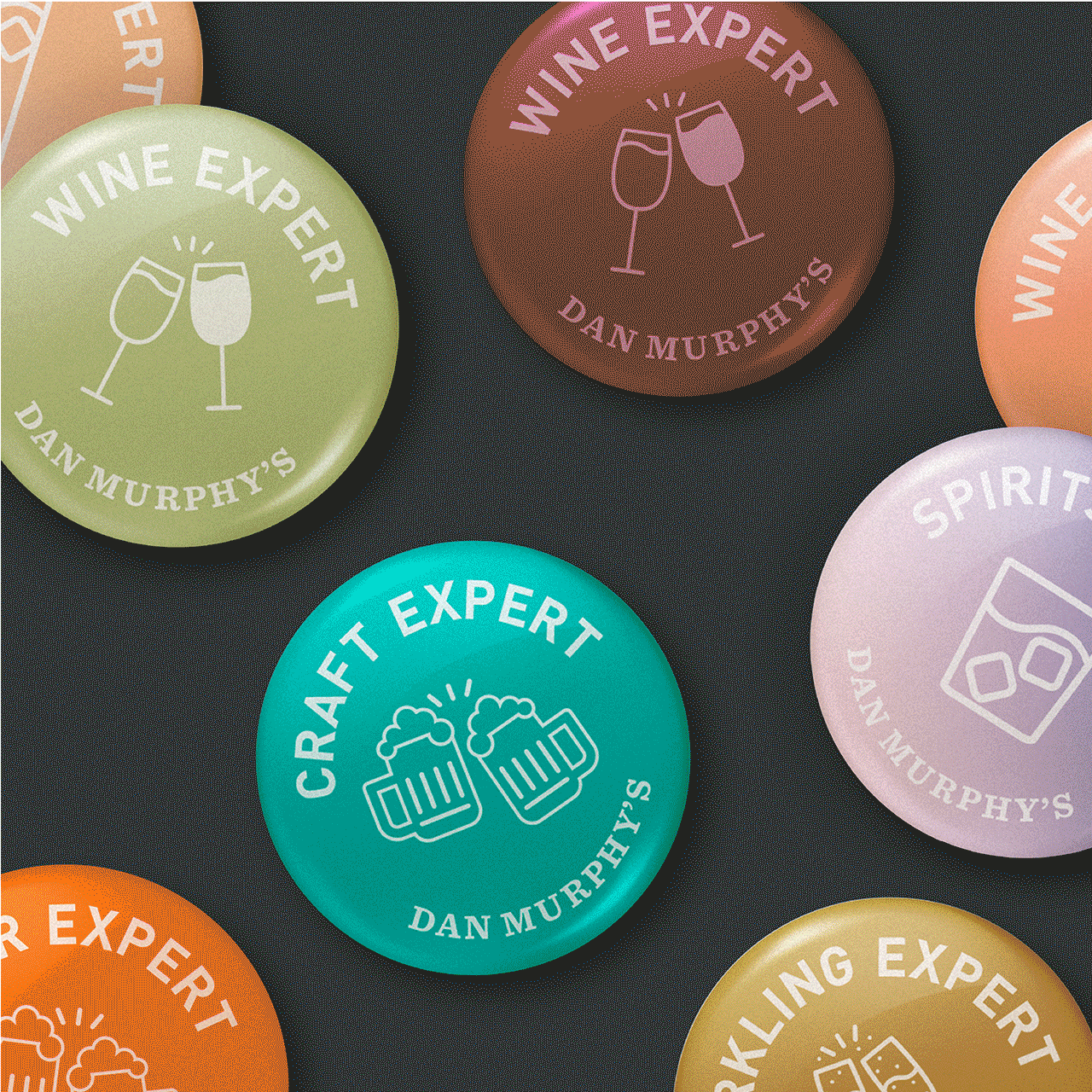
Raise a glass to brand storytelling
A celebration of wine and beer drinking in a place that personifies discovery and value. As we delivered multiple nuanced stores, we never wanted to lose homage to Dan Murphy’s original store on Chapel Street. With Dan’s nostalgic story at the heart of the space, we gave it the freedom to be dynamic and cater to ever-changing needs, from masterclass evenings to showcases, inviting customers to connect with the products.
From the tiered ‘Cellar’ to the ‘Zero’ pop-up and, most recently, super-premium high-ticket bottle tastings from rare vintages, there’s something for everyone in this rich design concept.
In a nutshell:

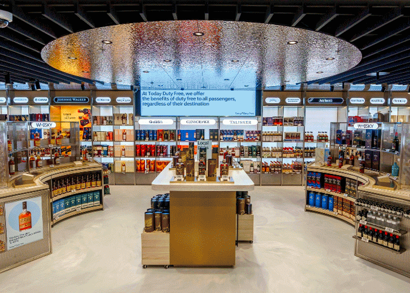
Unveiling a discovery-led destination for travellers in Lounge 1
'Today Duty Free' is making an impact with the travelling public at Schiphol. One of the first stores you encounter after leaving security in Lounge 1, it boasts hundreds of brands - varying from the niche and luxury to the joyful everyday. Local brands such as Tony's Chocolonely and Bols feature prominently, alongside worldwide favourites. Elevated categories include premium chocolate 'nooks' and a luxurious champagne corner.
The emphasis in this store is of a journey of discovery - perfumes, make up, cosmetics, liquor and confectionery - all with an added level of service ensuring the experience is as unique as you. The visual cues take reference from the reflectivity and undulation of clouds, with the intention of bringing a serenity and calmness to the shopping environment. Digital wayfinding and inspiration ensures future flexibility and seasonal change.
In a nut shell:
- Multi-brand retail in an international hub.
- A successful collaboration across multiple businesses.
- Bringing local and global brands to life.


Spaces that let your imagination take flight
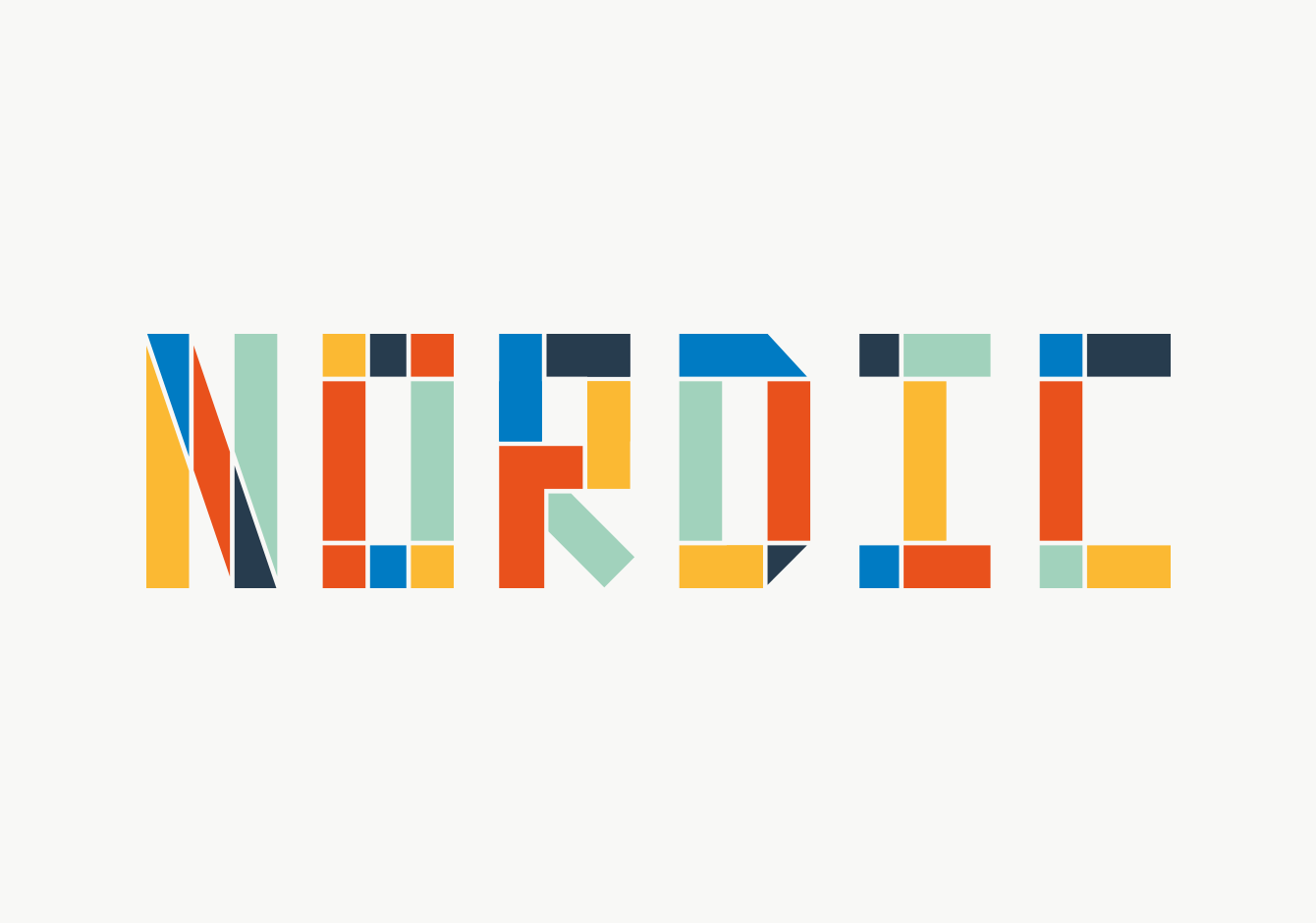
We’re proud of our distinct, memorable bar and restaurant spaces within airports across the world, including The Artisan in Belfast City Airport, reflective of Northern Ireland’s rich cultural heritage in literature and art with a five-meter immersive mural; Nordic Kitchen in Skavsta Airport, the centrepiece of the site with a 9,000 sp ft bar and 300 covers all aesthetically styled reminiscent of Scandinavian heritage; and a traditional open kitchen British pub in Manchester’s Terminal 3 airport with a ‘Pork and Pickle’ deli providing extending takeaway food service.
All airport venues aimed to provide travellers with a relaxing experience whilst showcasing cultural design elements in a setting of operational efficiency.
In a nutshell:


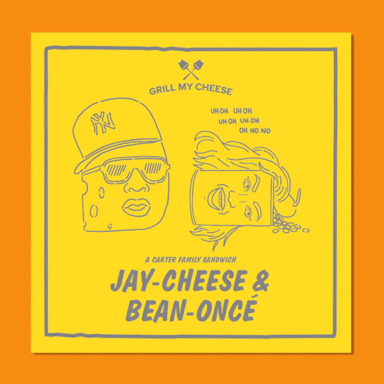
A big impact for a small business
As storytellers, we couldn’t resist a project with a backstory like this one. A city duo sick of their 9-5’s quit to pursue the dream of creating the best grilled cheese sandwich. No doubt they achieved that goal, but their existing branding hindered them from elevating and breaking into street markets.
Twelve was tasked with producing a new identity that encapsulated the entrepreneurs' passion for their product. In close collaboration, the new brand mirrored their superior product, vibrant personalities, and commitment to quality.
In a nutshell:


A bottle shop with attitude
With an immense product range and a matching reputation in Australia for drinks convenience, BWS set us on a quest to find a resonance with Gen Z shoppers. We needed to bring their stores up to date and find a way to appeal to more universal audiences.
Central to our approach was an amalgamation of BWS’s existing USPs: it’s huge product range, cheeky tone of voice, and magnetic team spirit. We translated this into a playful customer experience with a reinvigorated design language that fostered clear value messaging in a price-sensitive market supported by team spotlighting and localised range editing.
In a nutshell:

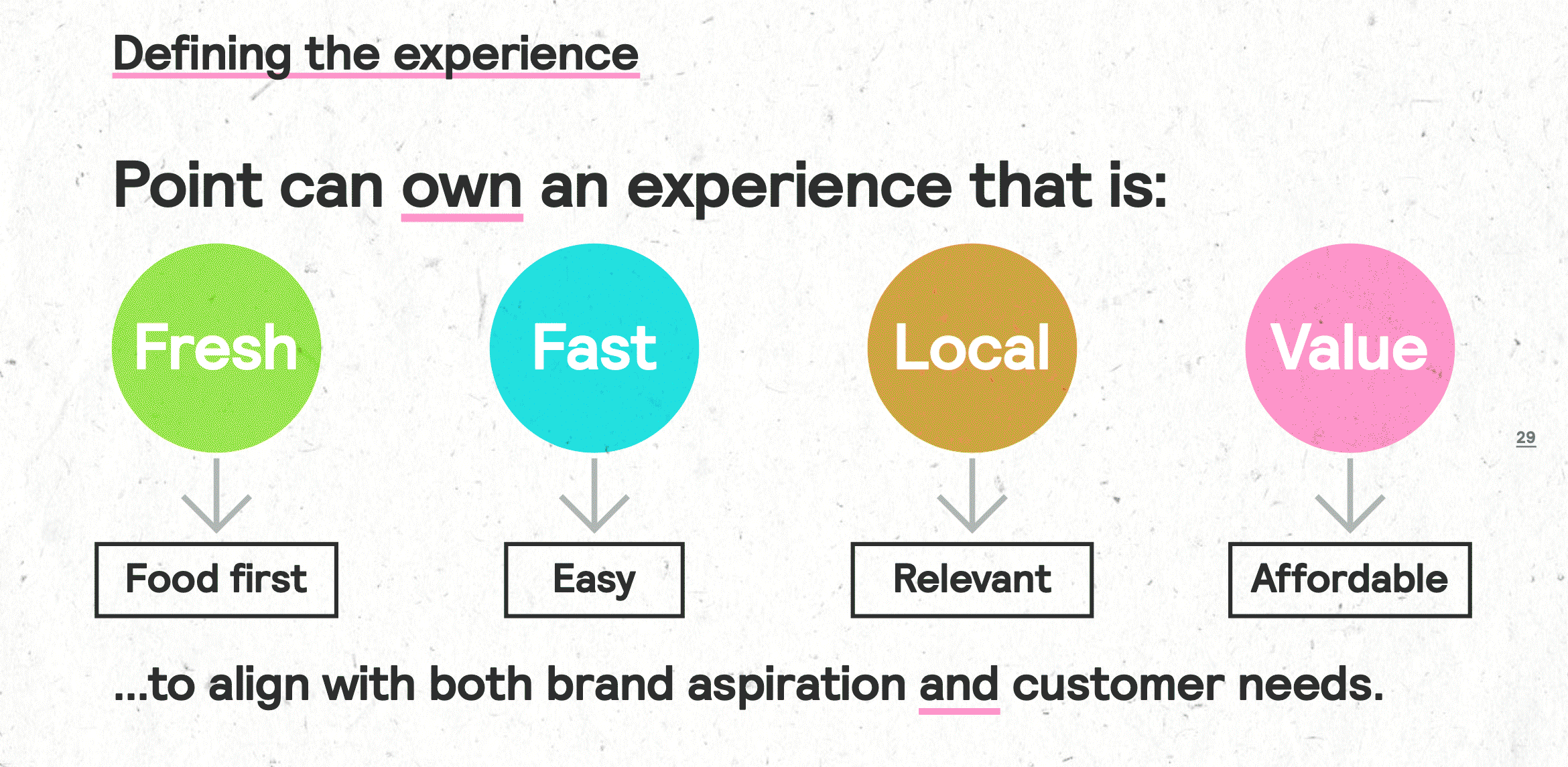
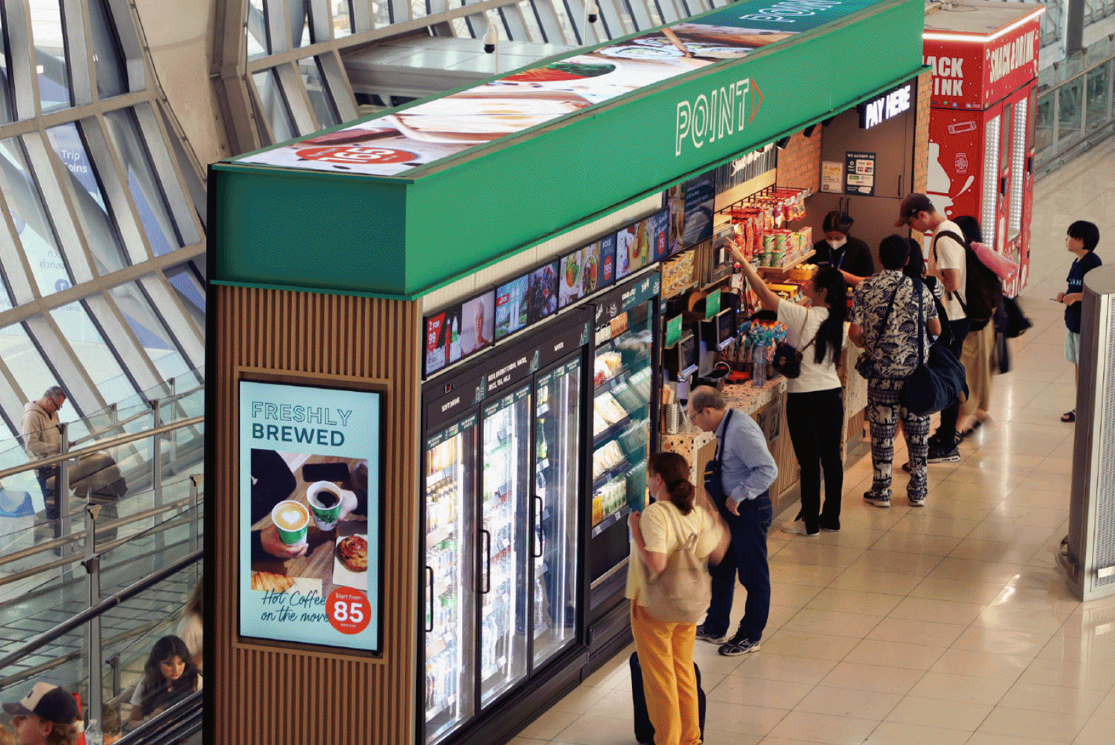
Future formats for the masses
In anticipation of SSP Point’s global expansion to travel points internationally, Twelve drummed up a creative retail concept centred on becoming the apex of the customer journey in transient spaces like airports and travel hubs. A bold and contemporary style using travel-themed graphic language and visual metaphors is the backdrop for a coherent environment of speed and ease with streamlined checkouts, clear visual hierarchy, and localised flair, adding a sense of individuation to each space.
Our internationally poised solution brings convenience, swiftness, and local authenticity to any space, having been intentionally designed to adapt and roll out with ease, ideal for its imminent launch.
In a nutshell:

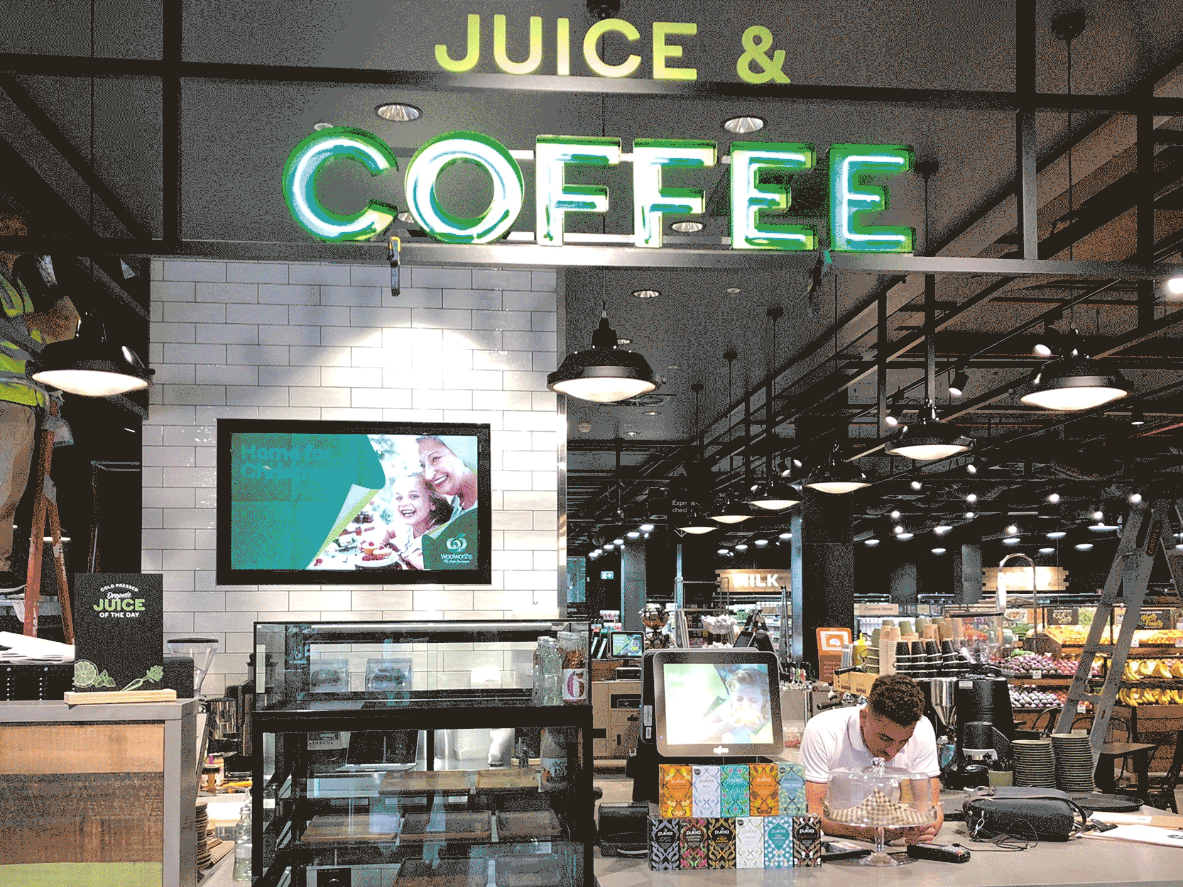
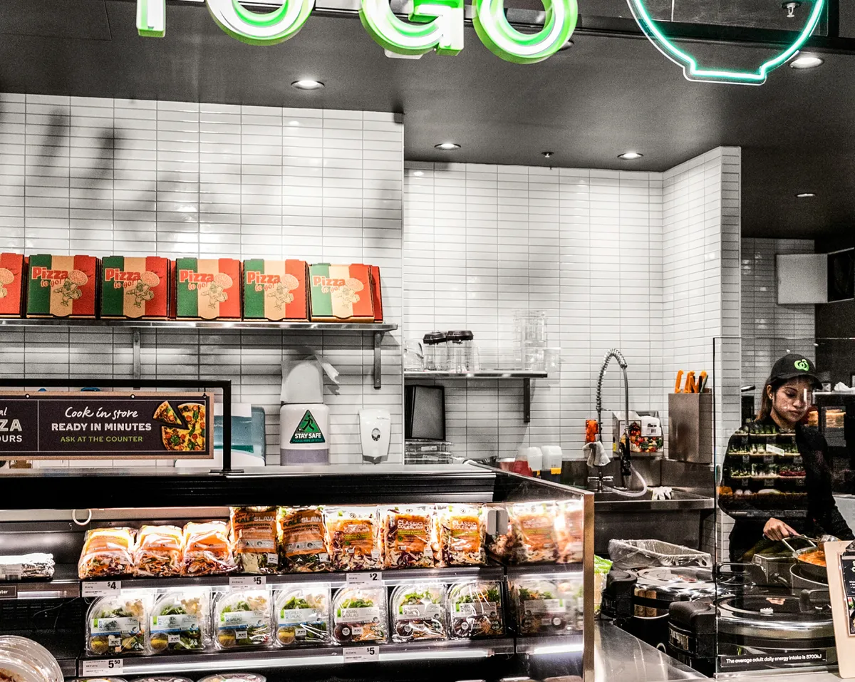
Enriching daily life for local customers
Situated in Double Bay, The Kitchen is a Woolworths concept store, emerging as a hub that combines sustainability, wellness, organic produce, and specialist incubator ranges from local suppliers. We aimed for a local hub that enriches daily routines from 100% organic coffee to an evening meal and everything in between.
This design included an inviting shopfront blending a vivid floral display with a coffee bar spilling into the street. The space is framed by a long-counter kitchen and kombucha bar.
In a nutshell:


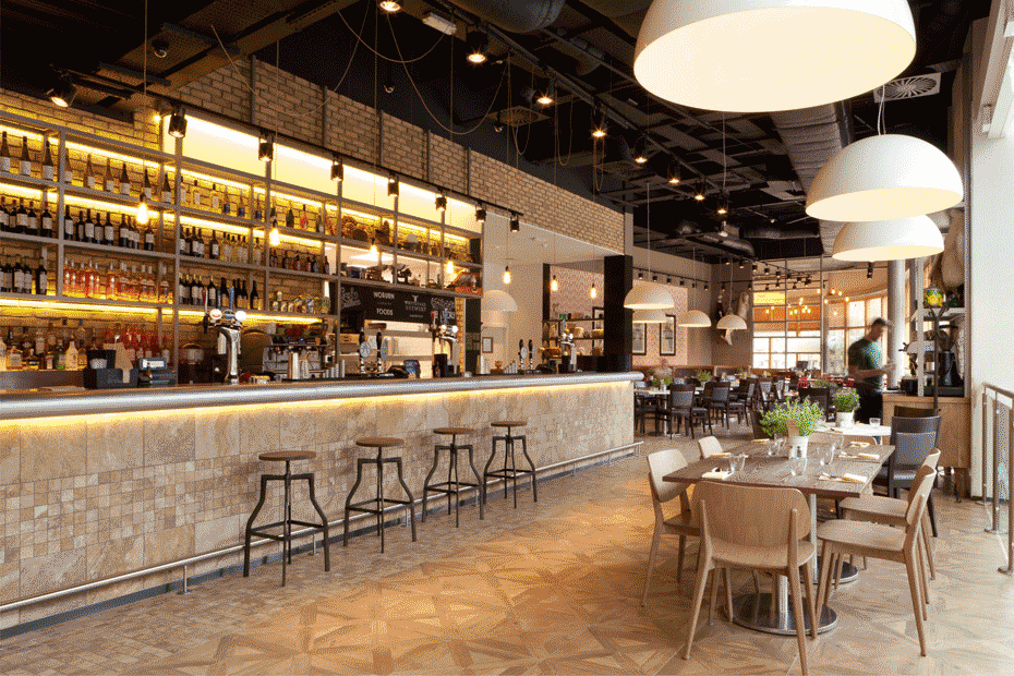
Dining with a difference
Center Parcs approached us to design a new gastro-pub for its new Woburn Park holiday village. The space we created catered to the restaurant’s differing needs by incorporating a series of areas that flowed into one another: an informal bar with substantial timber tables near an open kitchen with family booths and a slower-paced, more luxe vibe at the rear and outdoor terrace.
Our graceful design showcases different food service styles and answers the changing needs of Center Parcs’ visitors with elegance.
In a nutshell:


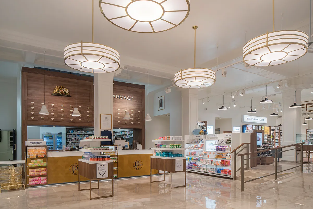
Brand consistency at every touchpoint
Locally sourced and homemade produce are the USPs of 10+-year-old Walsingham Farm Shop. We worked together to rejuvenate the shop’s current identity and create a platform for an exciting relaunch on a national scale. At the heart of this richly storied brand was a tale of honesty and integrity.
We reworked Walsingham Farm Shop’s existing brand symbol and gave it a new lease of life which was then deployed in-store, as well as throughout packaging, uniforms, livery, and online communications.
In a nutshell:


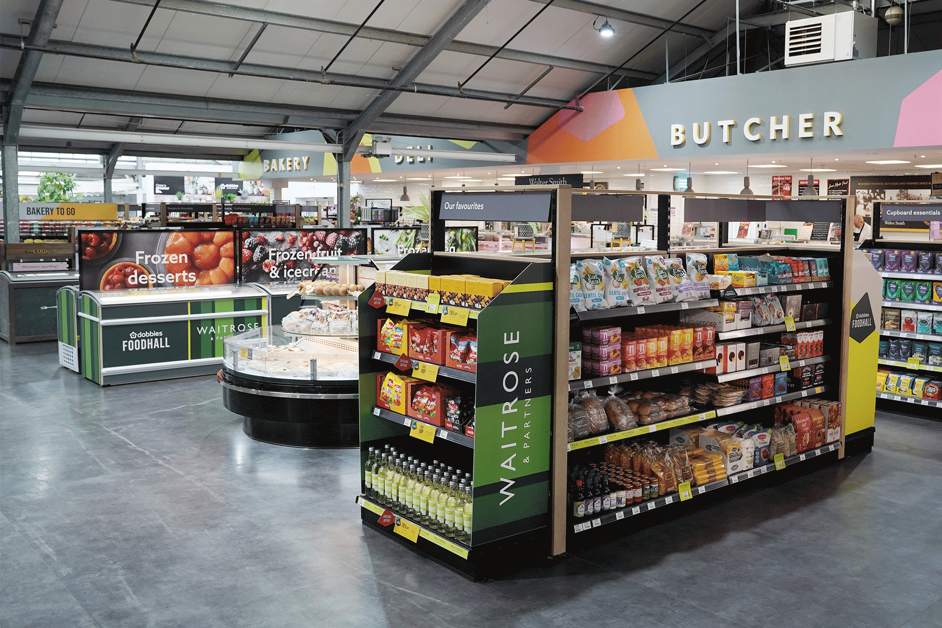
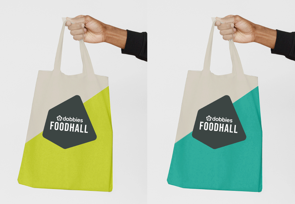
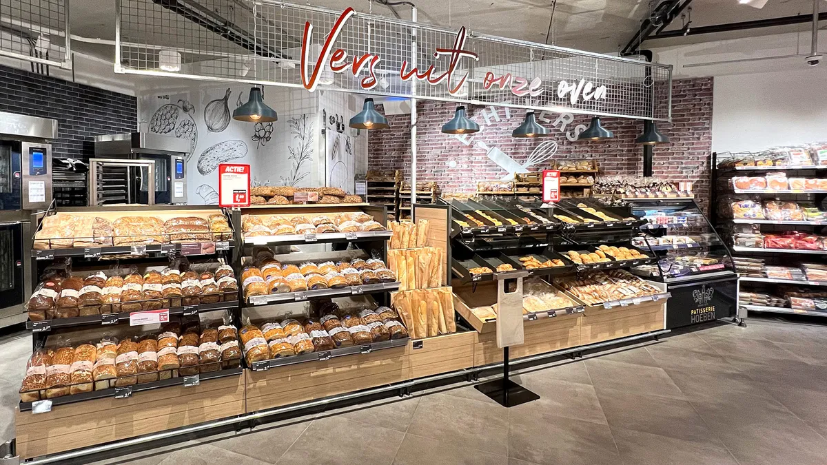
A piece of cake for Twelve
The ambition for Dobbies was to entice customers to the Foodhall in its own right, independent of the offering of the garden centre as a whole. Crafting a stand-alone identity for Dobbies Foodhall, we aimed to separate it from being a ‘category’ in the venue and create a distinct destination through a well-defined sense of place.
We integrated new and existing brand assets, sitting regional suppliers alongside a range from a new Waitrose partnership. The new positioning of Dobbies’ own Bakery to Go saw a 55% uplift in sales thanks to strategic changes.
In a nutshell:


Explore more sectors

Find us on social


London
The Old School House
41 Woodbridge Street
London, EC1R 0ND
+44 (0)20 7251 7878
Sydney
372 Elizabeth Street
Surry Hills
NSW 2010, Australia