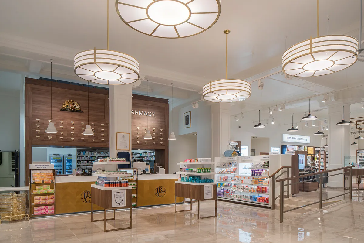
Something caught your eye?
Fill in the form below, and we’ll send you a curated portfolio of related work. Find out more about our creative process and how we add value to our clients' brand images.

Taking the stress out of ‘dinner for tonight’
Curry bars, sushi, a pizza oven, and an ‘entertaining zone’ with deli platters were just some solutions we used to intertwine shopping missions and meal occasions in convenience store Metro’s retail environment. Unity is at the core of this project, where design juxtaposed an intuitive layout with vibrant style and digital integration. The result? A seamless and dynamically delightful experience at every customer touchpoint.
Based on its collaborative feel, the space even features an artisan baker run by The Bread and Butter Project, which invests 100% of profits into training refugees in baking skills.
In a nutshell:


A mission-based concept for Convenience retail
The mission-based layout consolidates meal occasions, making it easier for customers to find what they need quickly.
This concept emphasizes speed and convenience in both delivery and collection, maximizing value within a smaller footprint.
An external delivery driver collection point supports various partners, while mission-led navigation and locally tailored product selections cater to specific demographics.
Lunchtime multi-buys, meal deal savings, and Aldi price matching are prominently featured, supported by digitally enabled offers tailored to different times of the day for increased relevance and flexibility.
In a nut shell:
• Stand out mission-led navigation.
• Digitally enabled to support flexible meal times.
• Partner brands drive footfall and convenience.
• Added value services - collection kiosks provide better availability.


Excited for what’s in store
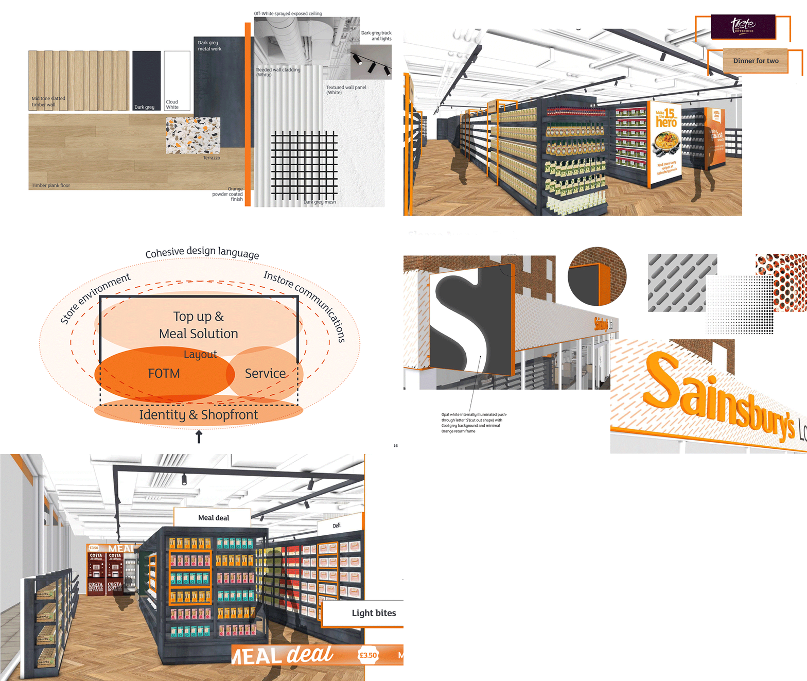
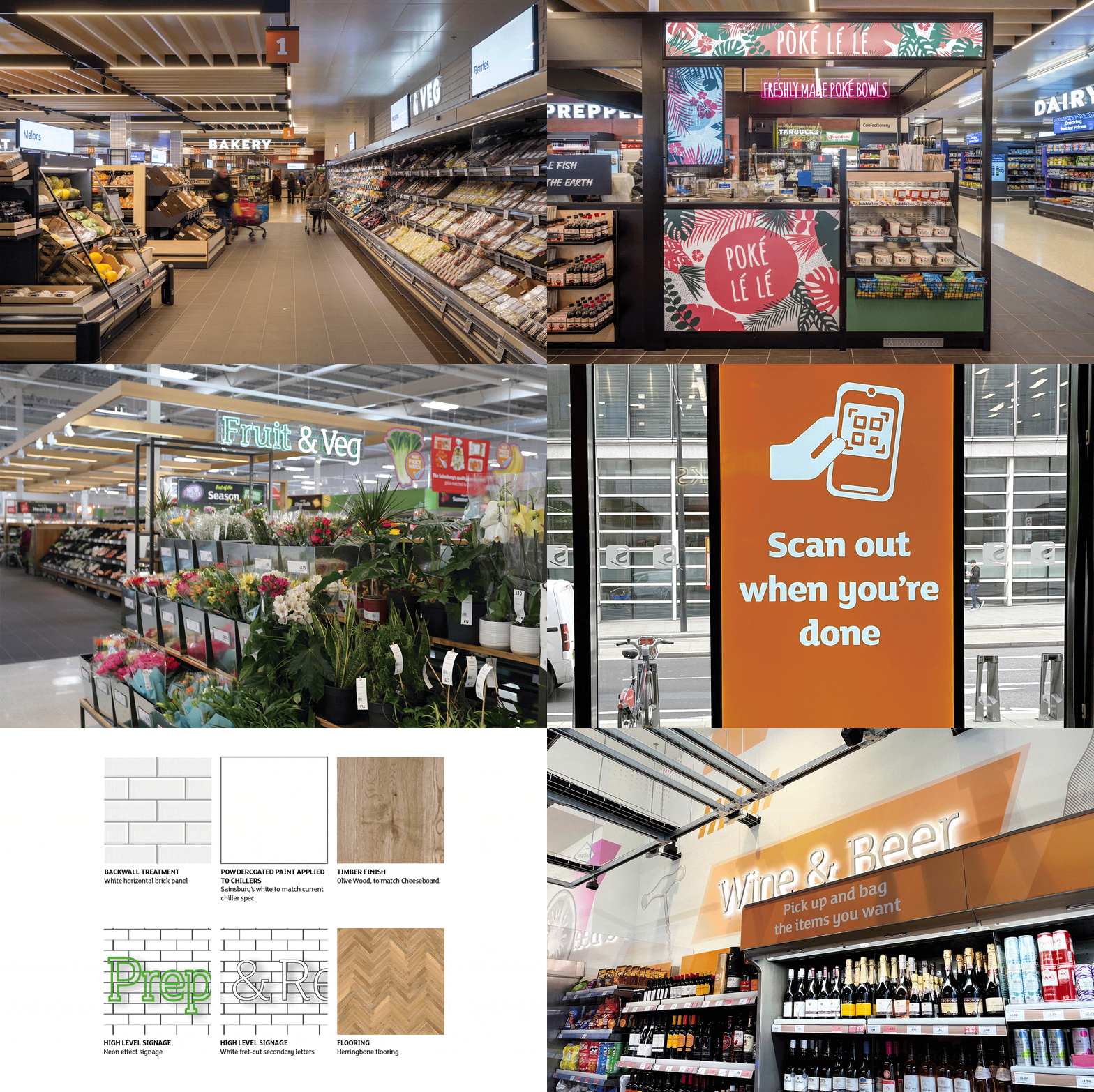
Faced with such a wide range of products in Sainsbury’s, trust is underpinned by the retail experience and customer journey. Working alongside Sainsbury’s, we not only support this trust but create it through consistent, simple, and instinctive concepts. And while we hone commercial viability, sustainability, and a welcoming feel, we’re always pushing the boundaries of the creative frontier to inspire innovation.
It’s thanks to this approach that our long-term partnership with Sainsbury’s looks ahead to an exciting overhaul vision for the future role of its stores. We can’t wait to see it come to life.
In a nutshell:


A six-month revamp to best-in-class
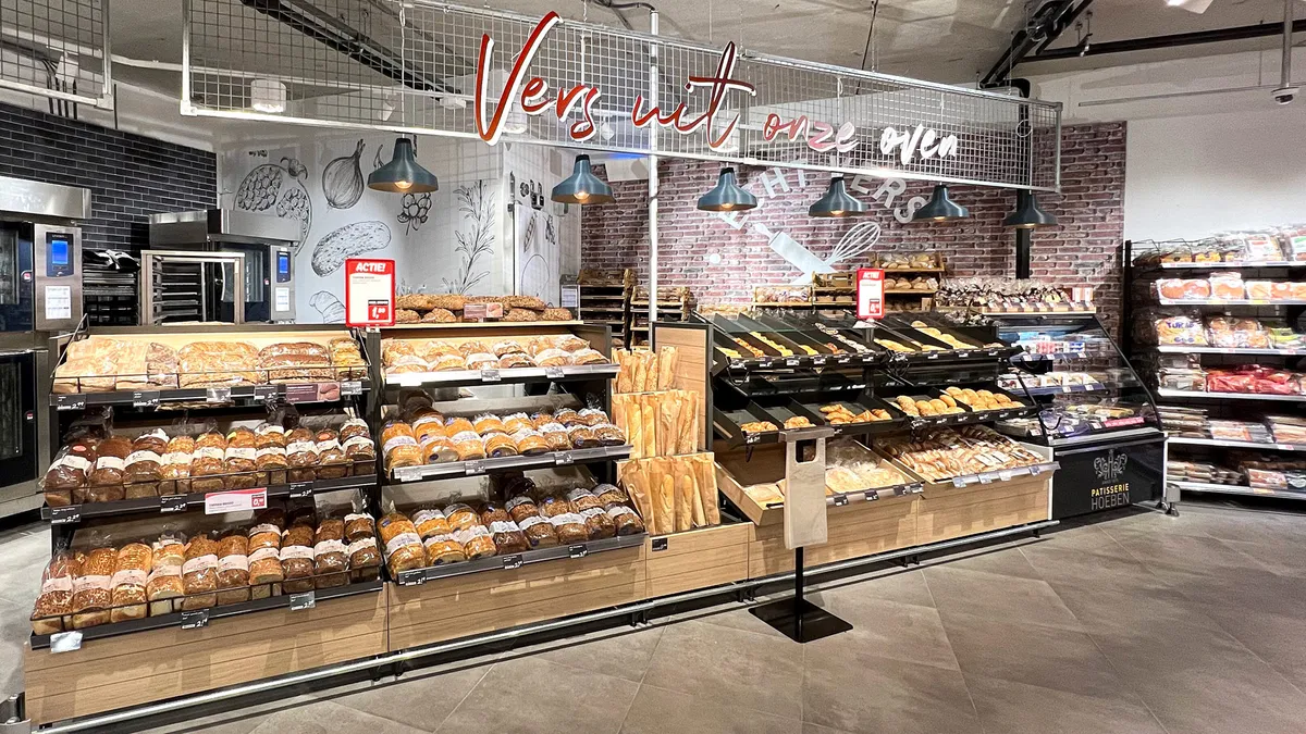
We aimed to fulfil the ‘best in class’ ambition held by Albert Heijn for its new XL retail environment, establishing clear hierarchies and hero categories. Stripping back to basics, we reimagined the customer journey to create a dynamic pace, focal points, and character that facilitated wayfinding through the environment.
This project demanded a strict management schedule involving a complete store overhaul on a stringent budget and express deadlines. We adhered to an expressly rapid programme to produce the transformation in just six months.
In a nutshell:
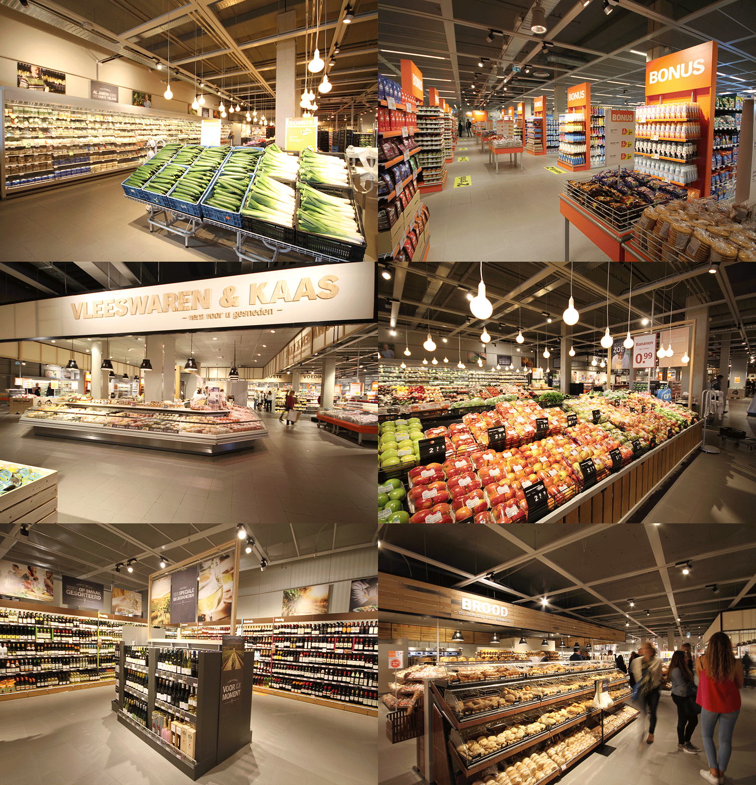

A fresh re-telling of DekaMarkt’s story
Thanks to our 15-year relationship with DekaMarkt, we know they’re humble farmers by trade with a deep love for locally grown products that help their communities thrive. It’s the story hundreds of supermarket chains wish they had, and it’s this we celebrated in their project, breathing life into their origins with storytelling that permeates their store environments.
Concept implementations from ‘World of Food’ in Marlo to ‘Deka Fresh’ in Haarlem, have translated DekaMarkt’s story into a customer experience, most recently being rolled out across the whole estate via the new 2.0 scheme.
In a nutshell:
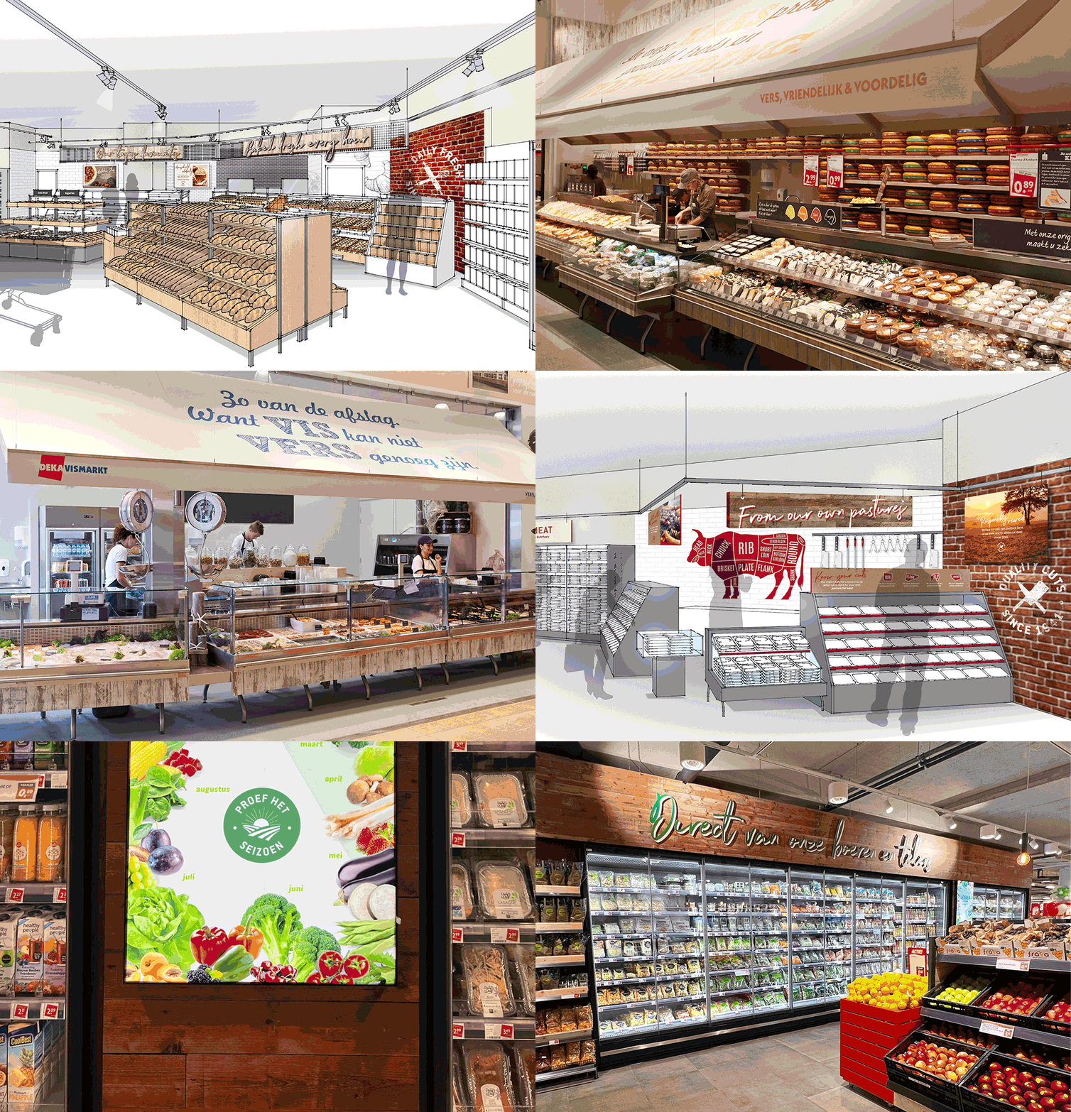

Fuel for thought in design cooperation
‘Food for now’, ‘food for later’, and ‘emergency top up’ were customer missions at the centre of a fuel forecourt design that intertwined convenience and food on the move. Strategic illuminated signage facilitates wayfinding for customers to either directly pay for fuel, shop for snacks, fresh food, alcohol, and soft drinks, choose a takeaway, or sit in and eat in a contemporary and fresh setting.
We worked symbiotically with supermarket giant REWE to harness high product density and operational requirements at a micro-level to facilitate absolute efficiency and seize every opportunity to bring the project together perfectly, even down to the tiny details.
Most recently, a partnership with Lavazza complemented its own-label Backfrisch bakery offer in-store—designed to feel compelling and distinct from the REWE master brand. The collaboration focused on a shop-in-shop concept that harmoniously blended both the Backfrisch and Lavazza brand palettes. This resulted in a unified, customer-first experience that engaged the senses through carefully curated product presentation, foodie cues, emotive photography, and illuminated signage.
In a nutshell:

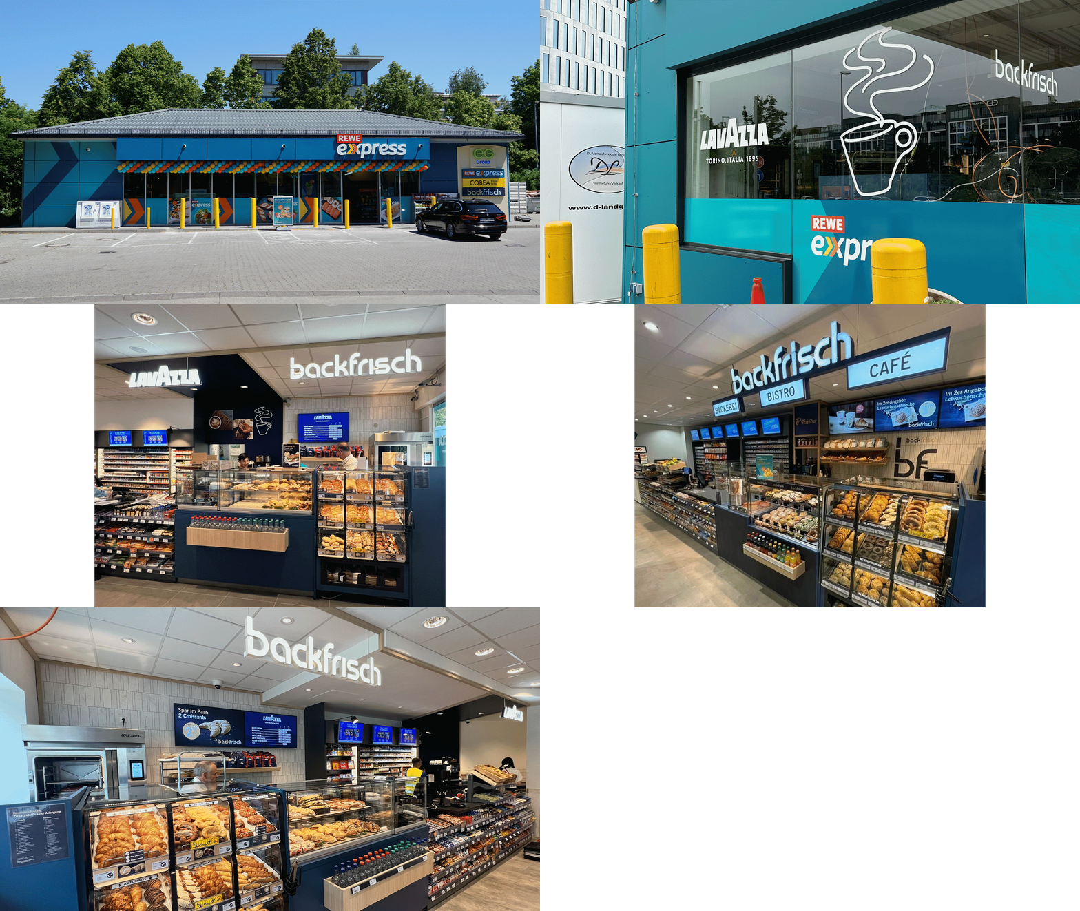

Defining success through partnerships and collaboration
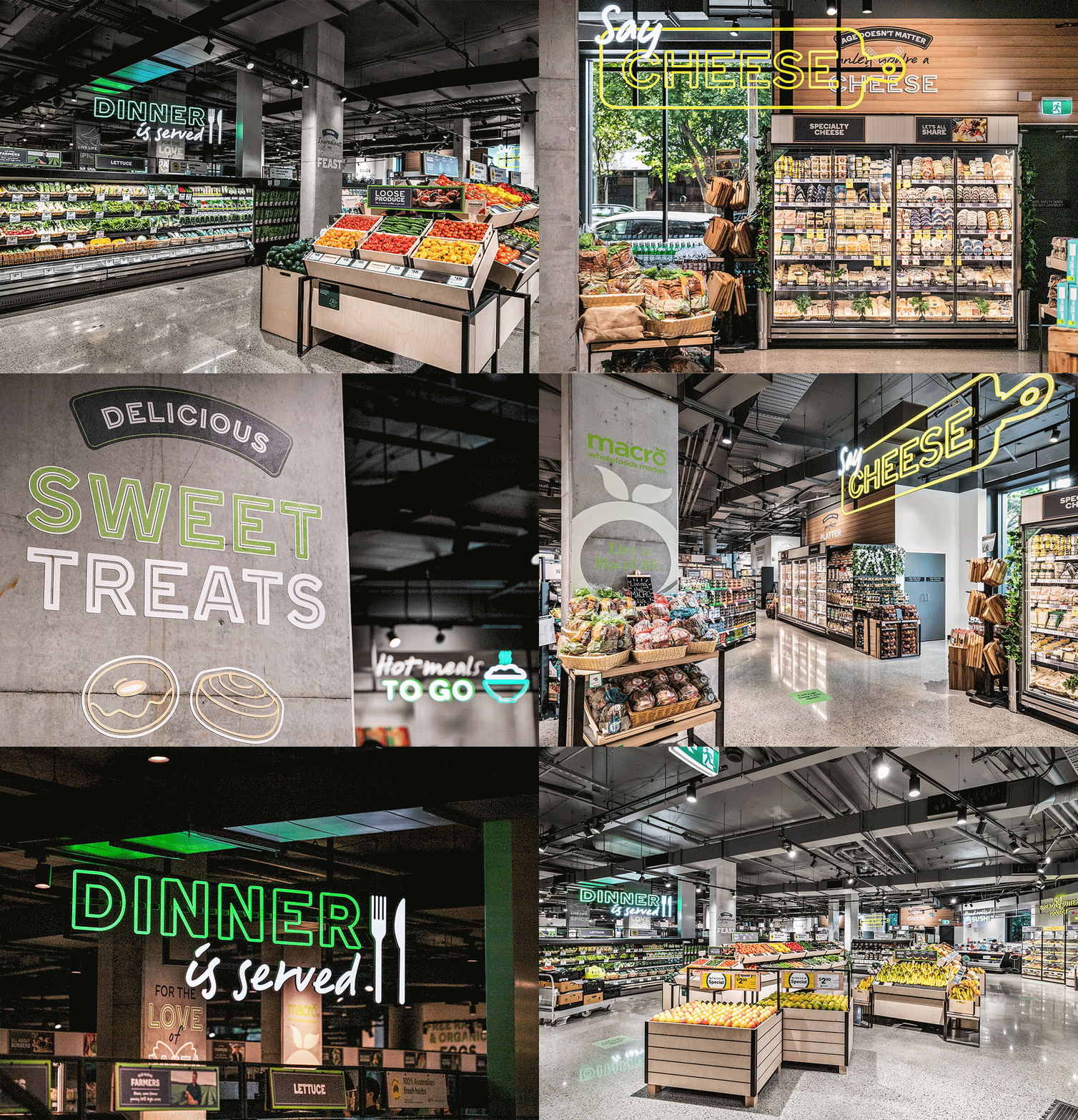
An out-of-the-blue call in 2016 for a full store refresh has since snowballed into a multi-site project and a Twelve-led journey to reach a ‘fresh food market’ ambition, now on iteration 3.5 for retail giant Woolworths. We won Woolworths trust with whole store strategies for all their business ventures from supermarkets to convenience (Metro) through category interventions and partner brands.
This is a true testament to how a focus on building relationships and thinking collaboratively can return in abundance for all involved. Our partnership led to a stream of projects that, through joint ambition, propelled Woolworths not only to progress but to elevate along its brand journey in order to set a distinct market-leading standard.
In a nutshell:




Explore more sectors
Find us on social


London
The Old School House
41 Woodbridge Street
London, EC1R 0ND
+44 (0)20 7251 7878
Sydney
372 Elizabeth Street
Surry Hills
NSW 2010, Australia


