Something caught your eye?
Fill in the form below, and we’ll send you a curated portfolio of related work. Find out more about our creative process and how we add value to our clients' brand images.

A destination value store for families
At the heart of the store are three thresholds, clothing, home and toys, each acting as a beacon across the expansive space and a destination for curated inspiration. Shopping is made easier through intuitive store layouts, clear navigation, and accessible service where it’s needed most.
Affordability is woven throughout the journey, with value-driven solutions, The store is designed as a welcoming, human space that creates engaging, memorable moments, whether it’s a family celebration, a first-time purchase, or simply ticking the essentials off the shopping list.
It’s an inclusive environment crafted for both parents and kids, aiming to make everyday family life brighter, better, and more joyful.
*Video by Good One
In a nut shell:
• Grounded in its proposition of "Your everyday family store"
• Logical layout, landscaping and vistas with clear & Simple Hierarchy of information.
• Intuitive adjacencies based on the customer missions.
• Category personality amplified through bespoke application and layering.


Building a green-fingered world from the ground up
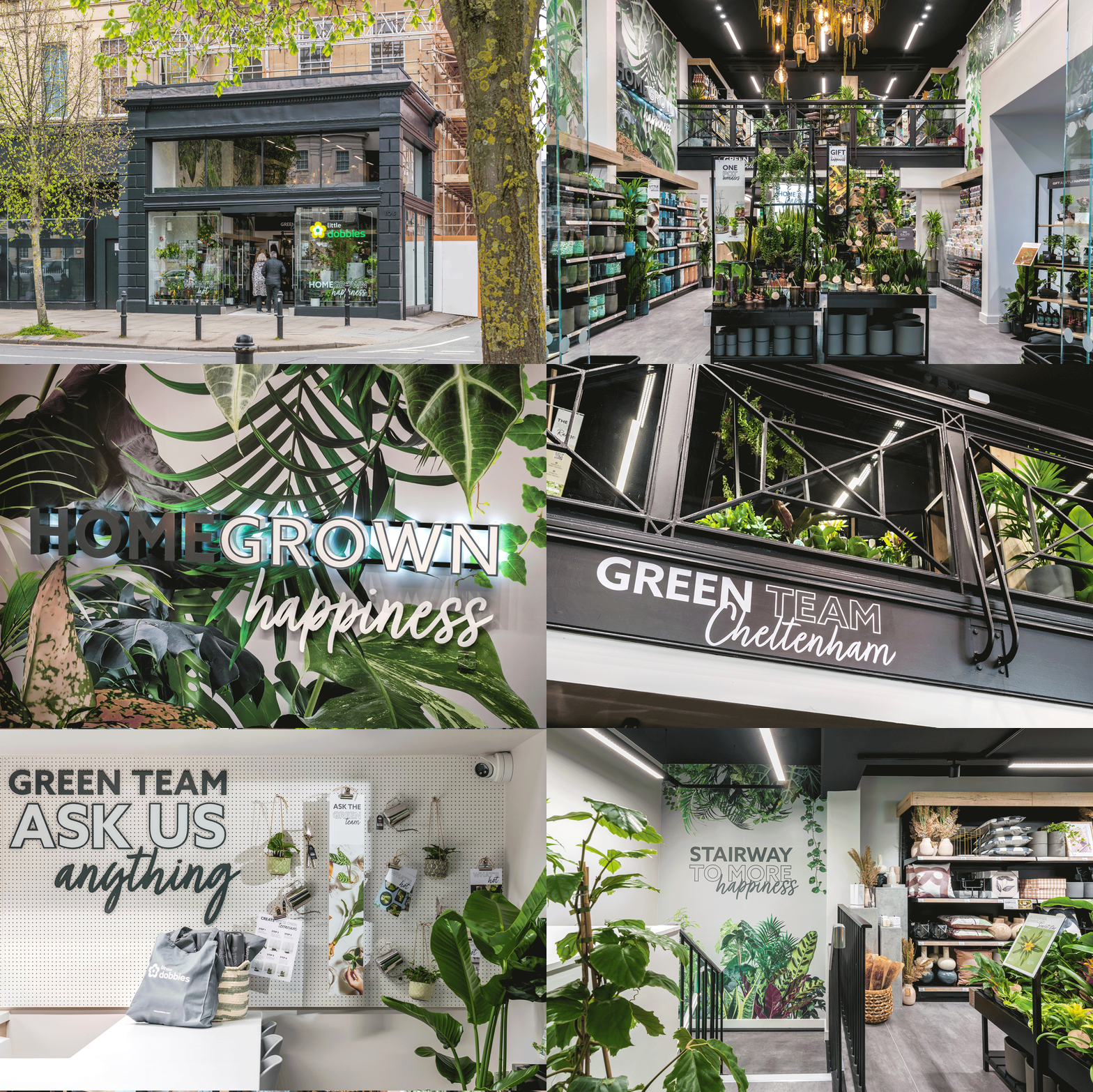
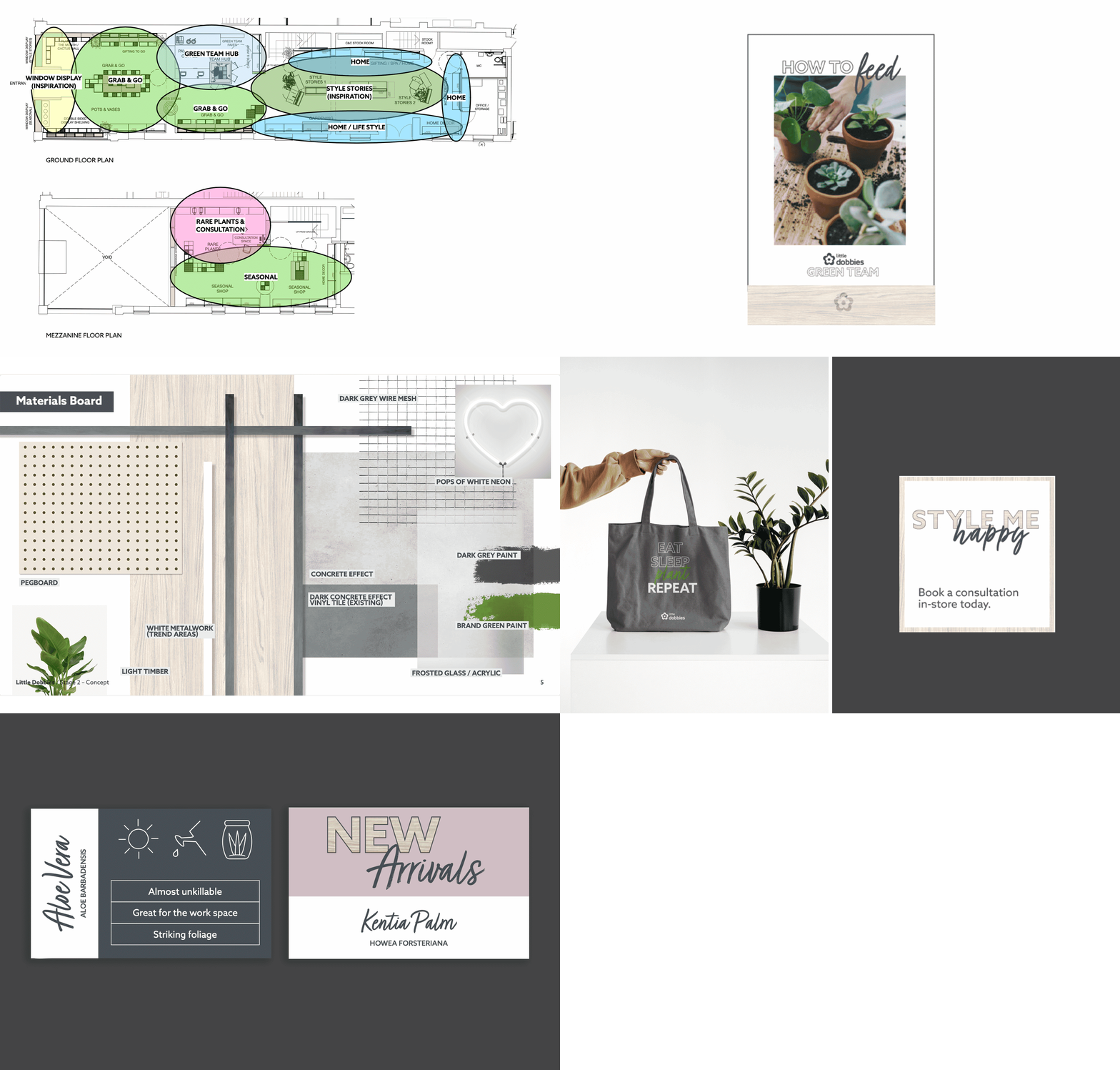
For our second project with Dobbies, we were tasked with crafting a dual-level gardening hub on Cheltenham Promenade that fulfilled five key shopping missions. We sought a combination of digital platforms and ‘Style Stories’ for showcasing trends and collections whilst staying loyal to the ‘Homegrown Happiness’ central to Dobbies’ core identity.
Across the listed two-storey building, customers can explore the extensive range, book sit-down consultations with the local, knowledgeable team, and take part in workshops.
In a nutshell:


Into the heart of the kitchen
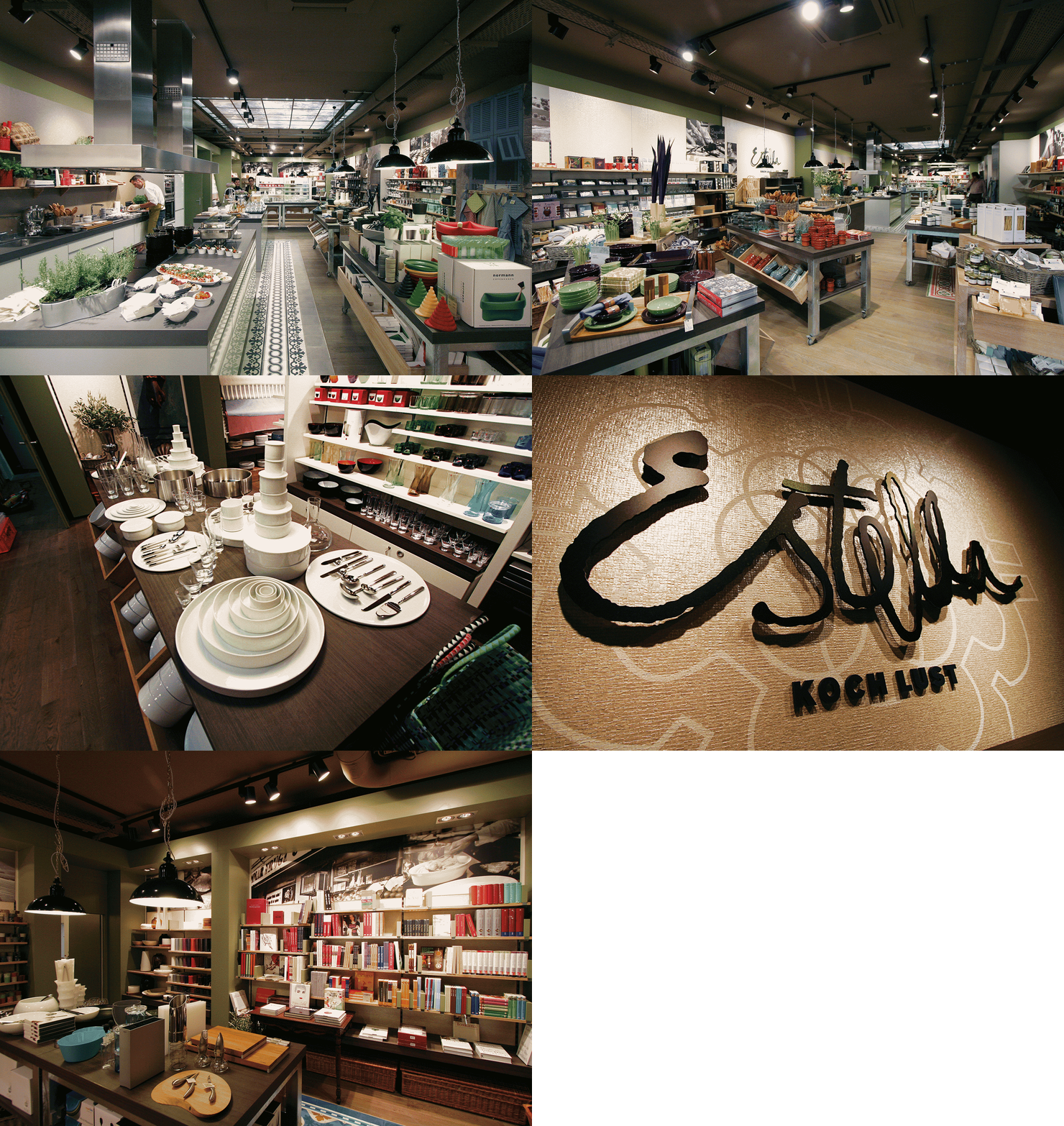
Inspired by the simplicity and quality of Mediterranean cuisine, Estella is a brand-new, unique retail chain that captures the joy of cooking, great food, and togetherness. A delightful convergence between kitchenware store, food retailer, and cooking experience, we created a memorable experience for anyone who walks through the door.
How did we do that? By making an environment that brews excitement about cuisine from all angles. The result featured a cookbook library, curated product ranges, and a central working kitchen operated by the in-house chef where customers can enjoy demos, tastings, and product showcases, all framed by a digital sky that changes to mirror the passing day.
In a nutshell:

The spark in everyday shopping
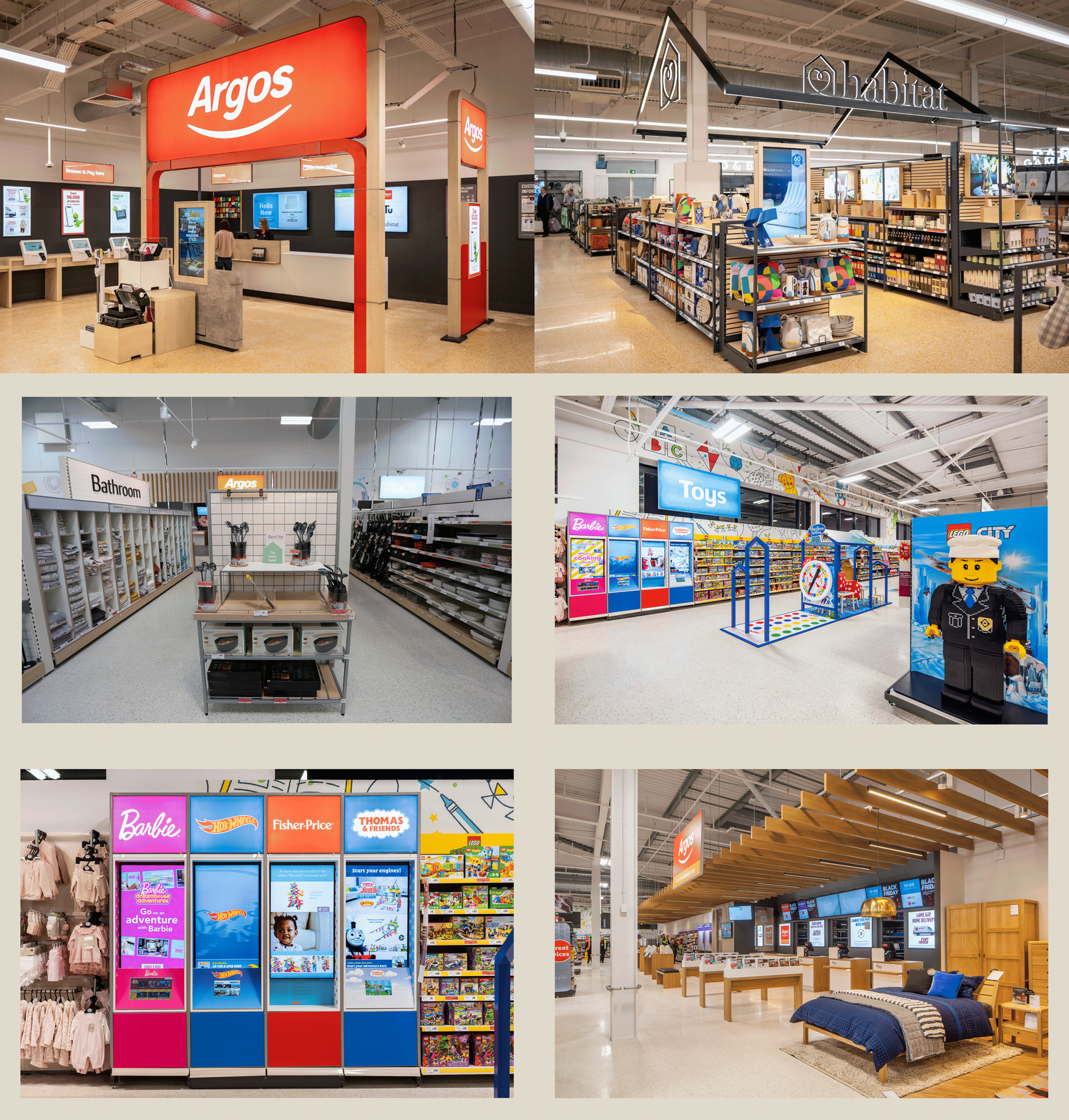
Managing ‘projects within projects’ is a key part of our ongoing relationship with Sainsbury’s, and this was one such project for Argos and Habitat under the Sainsbury’s umbrella. We implemented strategic and creative use of fixture landscaping, wayfinding, communications, and lighting to create distinct memorable experiences that naturally integrated services under the ‘Sainsbury’s’ personality.
What was the impact of this? Through the integration of disparate services using intuitive design, we open up a spectrum of convenient offerings. The results interplay and create memorable experiences of efficiency, exploration, and fun.
In a nutshell:
A high-street shopping experience in a supermarket
We ran with Sainsbury’s vision of recreating the feeling of a high-street clothing shop in a supermarket setting for the clothing brand Tu. Carefully, we crafted a more personal and intimate browsing experience with subtle layout adjustments, landscaping, lighting, and materials. We backed our design choices with a mid-floor fitting room and personalised styling services, landing some exclusive labels in the clothing shop along the way.
At the end of our project, Tu was a central brand upheld amidst an offering of smaller, complementary labels in activewear, partywear, plus sizes, and more, creating an effect of positive synergy in the space.
In a nutshell:


Shopping mission: following our intuition
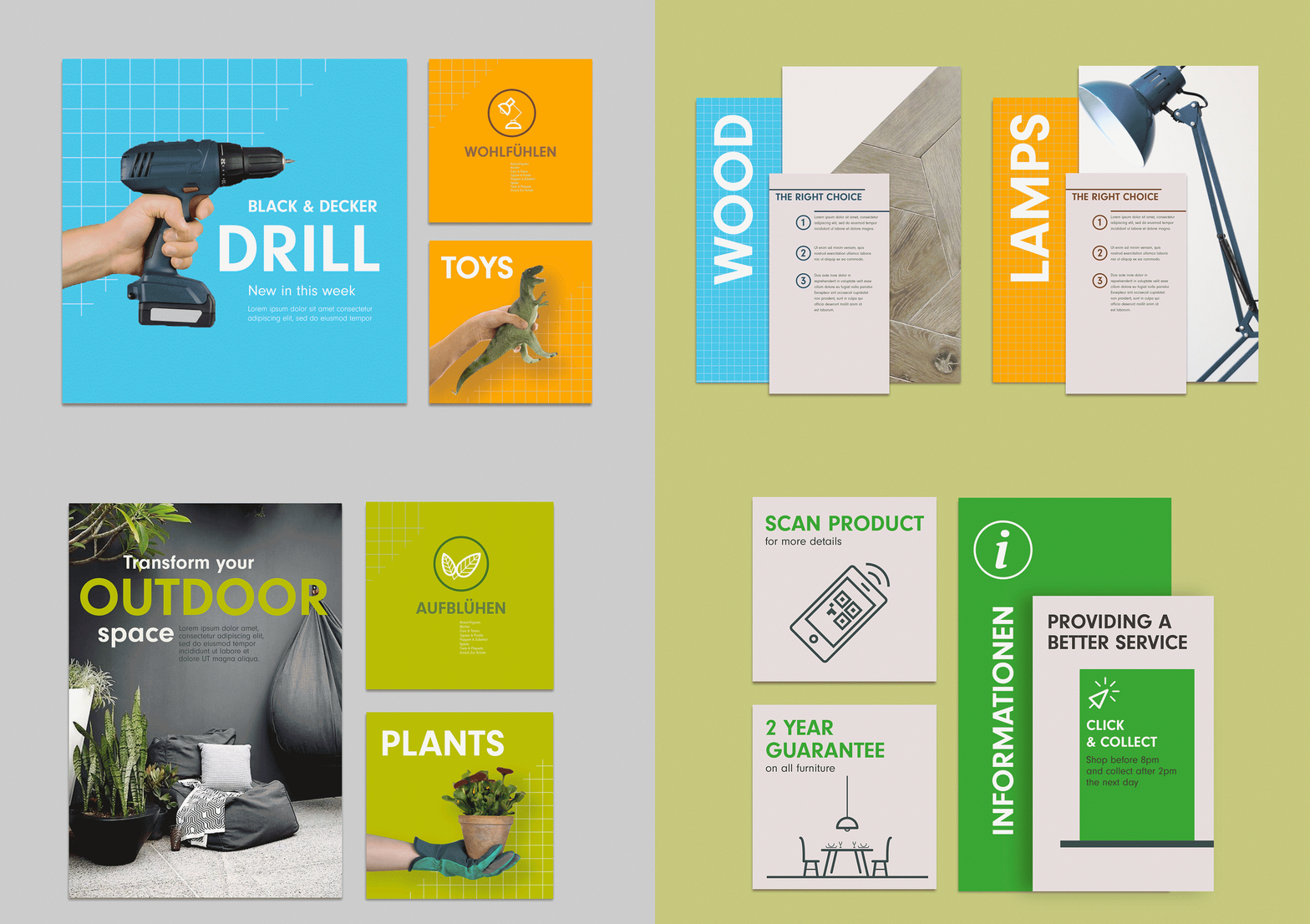
Twelve embarked on a journey of rejuvenation for DIY chain Knauber’s flagship store, aiming for a new, well-guided shopping experience with intuitive, informational, and efficient design elements.
Our design concept embraced a well-structured layout with large and impactful wayfinding, category hero displays, and product information, all punctuated with colourful point-of-sale materials. Everything was held together under a consistent application of brand character.
In a nutshell:


Expanding our design toolkit
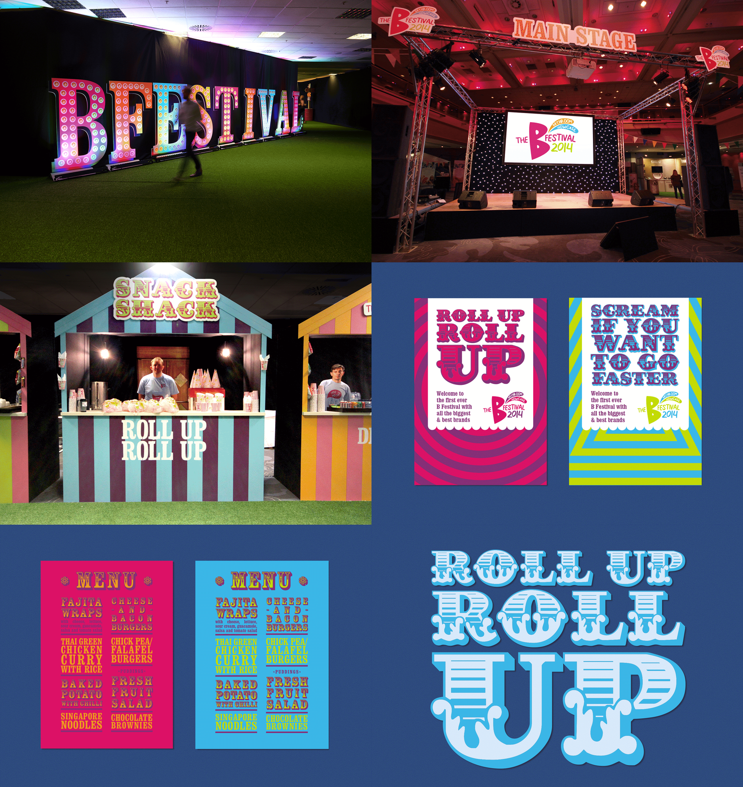
In 2014, we embarked on a multifaceted journey with Travis Perkins and what would become an ongoing diverse mix of projects, from delivering in-house showrooms and launch events to own-brand packaging and print material.
Our ongoing relationship with Travis Perkins can be attributed to a meticulous understanding of the brand’s identity, personality, and ethos as a builder’s merchant and the audience that resonates with. We were determined to build upon the perceptions of the brand whilst delicately balancing this with innovative brand enhancement.
In a nutshell:

A physical portal for an online industry kingpin
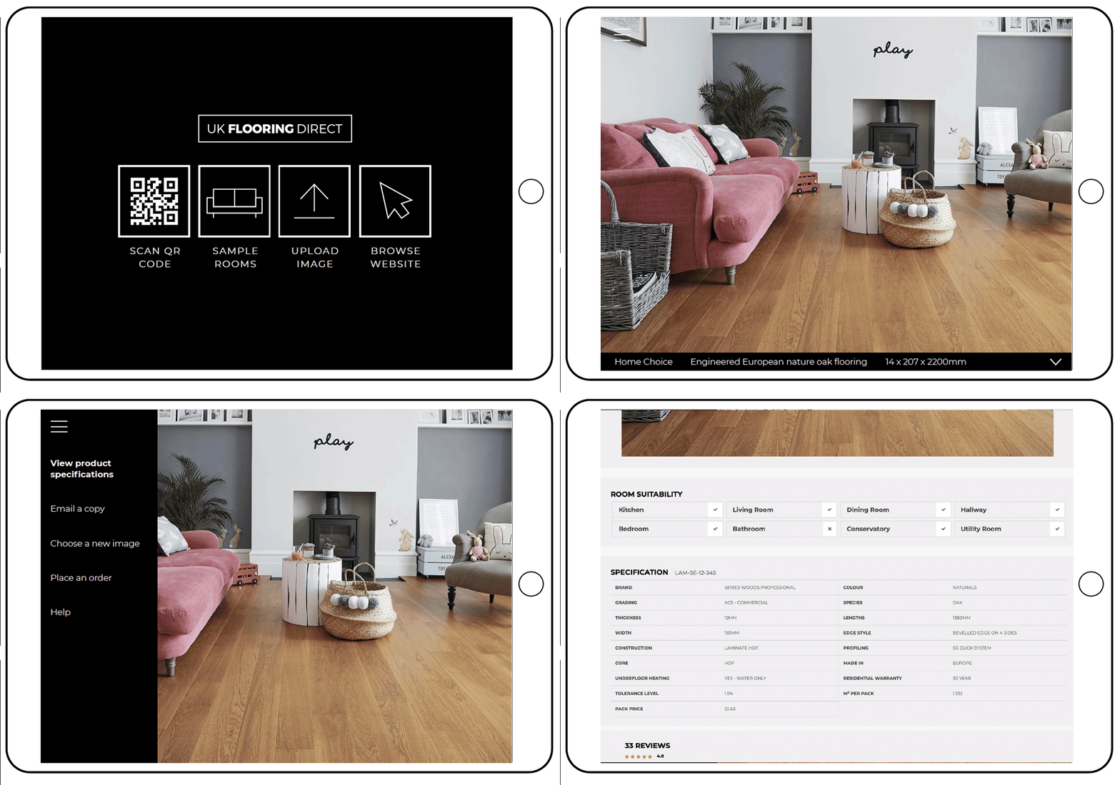
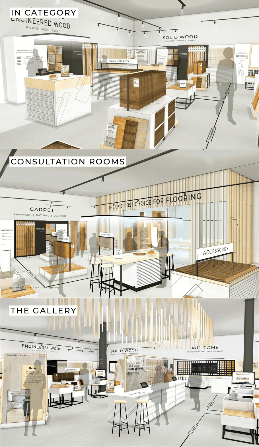
As a well-established online business, UK Flooring Direct needed a retail presence that would act as a physical portal for the brand and represent the first in a series of geographical hubs, appealing to two audiences simultaneously, combining consultation areas, showing off current and future products, and offer a trade counter.
We approached this multi-purpose dynamic space through the filter of modern synthesis. Practical design, technological integration, immersive exploration of products, and dedicated customer spaces were brought together with styling that ensured the brand’s ‘discount box shifting image’ was not lost.
In a nutshell:


Explore more sectors
Find us on social


London
The Old School House
41 Woodbridge Street
London, EC1R 0ND
+44 (0)20 7251 7878
Sydney
372 Elizabeth Street
Surry Hills
NSW 2010, Australia
