Something caught your eye?
Fill in the form below, and we’ll send you a curated portfolio of related work. Find out more about our creative process and how we add value to our clients' brand images.

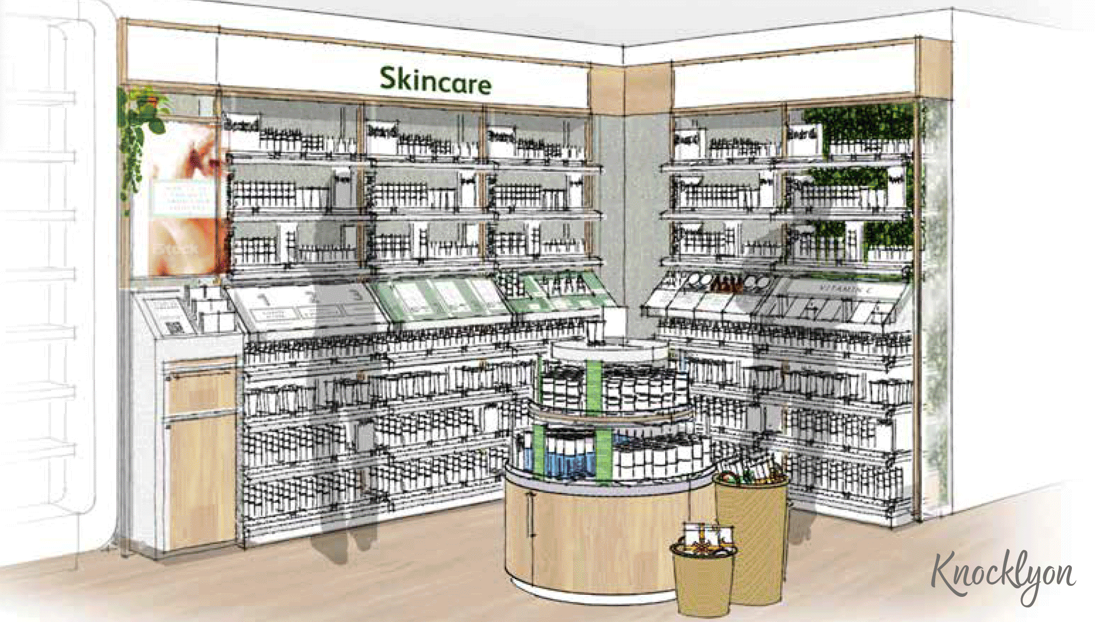
London’s first health and wellness emporium
Coming from a rich history having opened in 1789 and being granted a Royal Warrant in 1909, John Bell & Croyden is a well-respected pharmacy that demands an environment to match. Our aim was to bring the establishment into the modern age whilst preserving its heritage and architecture. Our reimagining transformed John Bell & Croyden into a genuine health destination.
Character was injected into the space with signage demonstrating the quintessential British wit without losing the brand’s position as a trusted expert on all things healthcare. Convenient, intuitive journeys and discreet consultation spaces exude an atmosphere of welcome and comfort.
In a nutshell:


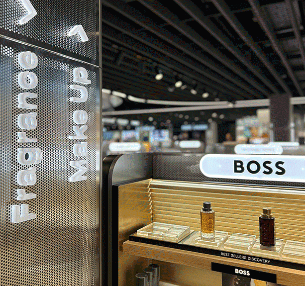
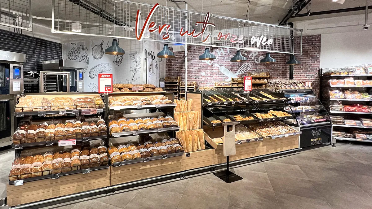
Unveiling a discovery-led destination for travellers in Lounge 1
The emphasis in this store is of a journey of discovery - perfumes, make up, cosmetics, liquor and confectionery - all with an added level of service ensuring the experience is as unique as you. The visual cues take reference from the reflectivity and undulation of clouds, with the intention of bringing a serenity and calmness to the shopping environment. Digital wayfinding and inspiration ensures future flexibility and seasonal change.
'Today Duty Free' is making an impact with the travelling public at Schiphol. One of the first stores you encounter after leaving security in Lounge 1, it boasts hundreds of brands - varying from the niche and luxury to the joyful everyday. Local brands such as Tony's Chocolonely and Bols feature prominently, alongside worldwide favourites. Elevated categories include premium chocolate 'nooks' and a luxurious champagne corner.
In a nut shell:
- Multi-brand retail in an international hub.
- A successful collaboration across multiple businesses.
- Bringing local and global brands to life.


An online to physical experience
The concept invites customers to revive and thrive through a store and pharmacy experience, designed as an oasis of calm and wellbeing.
Featuring living walls, natural materials, and carefully lit spaces, the environment is crafted to promote a friendly, expert environment for both customers and staff. It’s a place to pause, take a breath, and bring your healthiest self to life with expert-backed advice, industry-leading wellness experiences, and tailored product solutions—offering so much more than just a place to shop.
In a nut shell:
• A retail space that extends the online brand.
• An opportunity to reflect Healthy Life's full potential to investors and loyal customers.
• Industry leading wellness experiences.


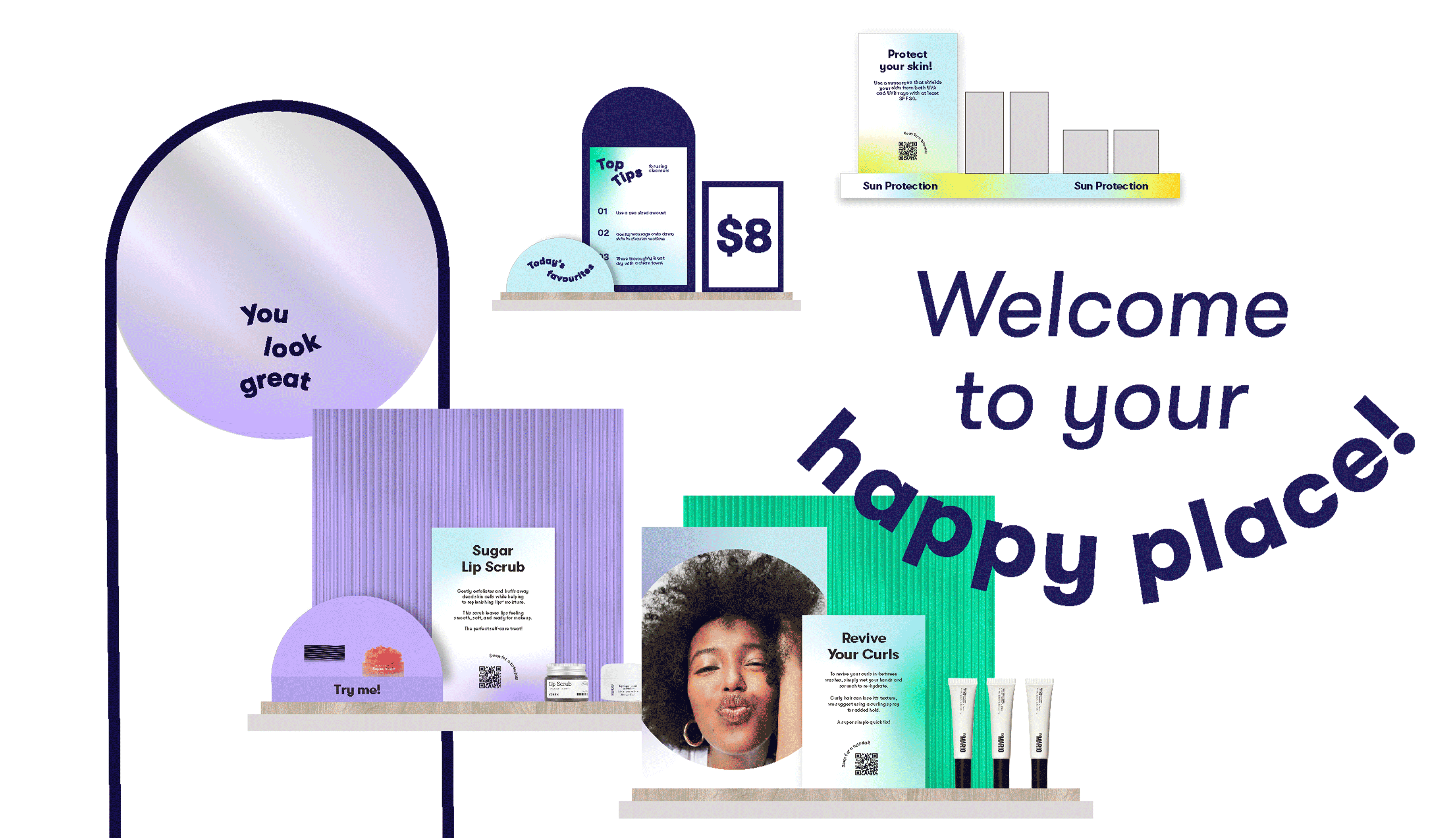
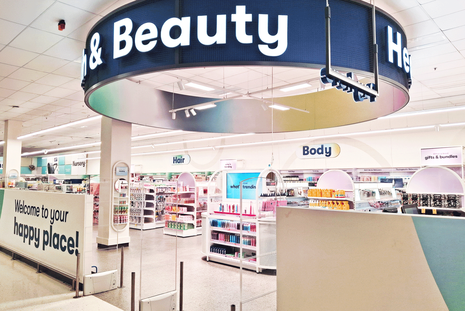
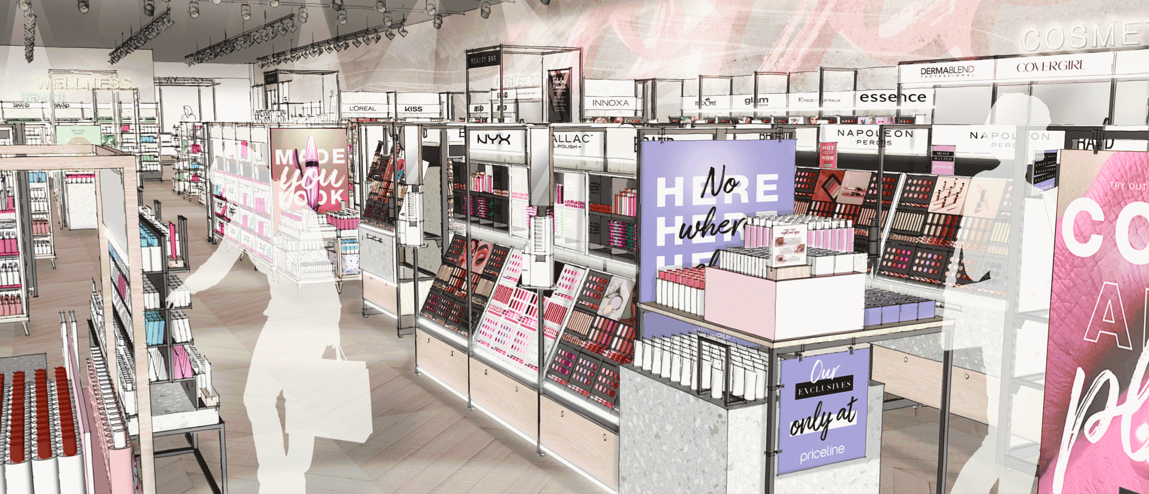
Where beauty gives you more
BIG W is set to become the go-to beauty retailer for value-conscious families. Customers are seeking discovery, quality, and curated beauty offerings—all at an affordable price.
It aims to build loyalty among Gen Z and Millennial shoppers by providing a wide range of affordable, high-quality products and brands. With exclusive and differentiated owned brands not available elsewhere.
The brand creates distinct experiences across categories through the use of colour and enhances the shopping journey with digitally enabled discovery tables that provide flexibility for brand takeovers and new product launches.
In a nut shell:
• An affordable beauty destination for all.
• Digital discovery tables support product exploration.
• Differentiated category worlds to celebrate product range.


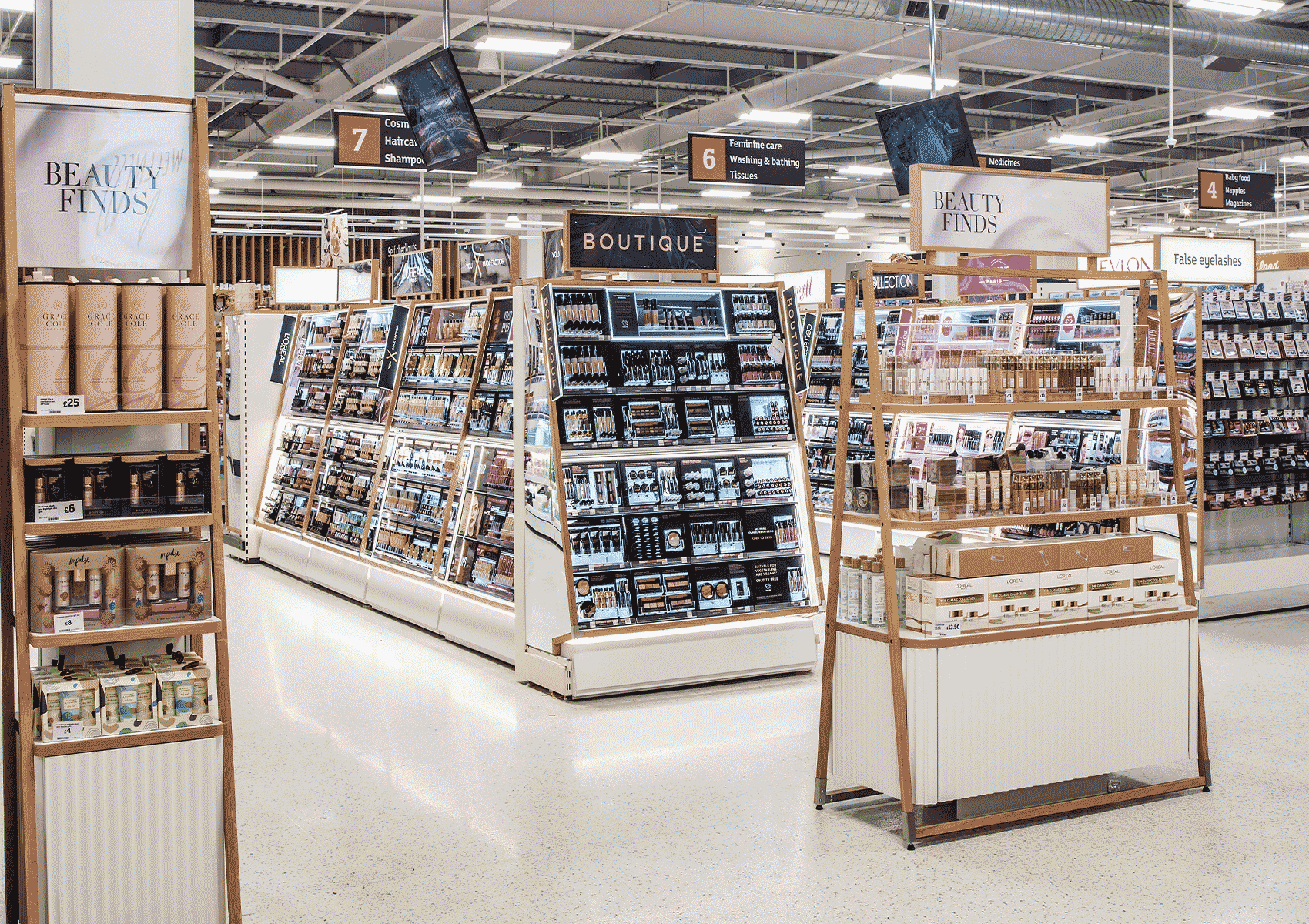
A beauty department that doubled sales
With a core goal to offer space for exploration whilst maintaining an underlying recognition of the Sainsbury’s brand, our approach to the beauty department refresh was one of adaptability, flexibility, and attention to detail. Strategic elements of lighting, edit spaces, and modular fixtures made a dynamic space that invites customers in on their weekly shop via a browsable flow.
On-brand highlights, soft textures, and a calming atmosphere aligned the space with high street beauty halls, with an added premium feel and overarching curation with the Sainsbury’s label.
In a nutshell:

Good design doesn’t have to be complicated
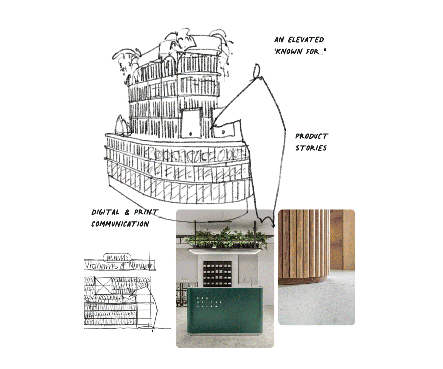
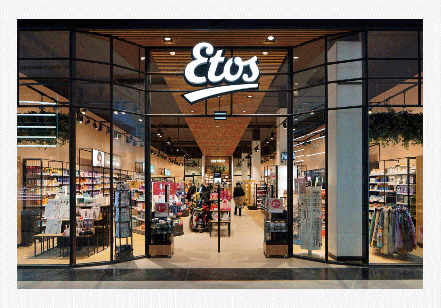
Health and beauty household name Etos opened doors on a brand new design concept on its centenary and one that completely transformed its look and feel, catapulting it into the modern age of wellbeing, backed by its expertise and authority in the sector. We devised the new space based on a think tank of people in one room: combining client-side stakeholders, Twelve experts, and a local Dutch agency.
Our collaborative capabilities meant that in just two days, our vision had set the wheels in motion for a new aesthetic that proved so influential it led to three more projects with affiliated brands.
In a nutshell:

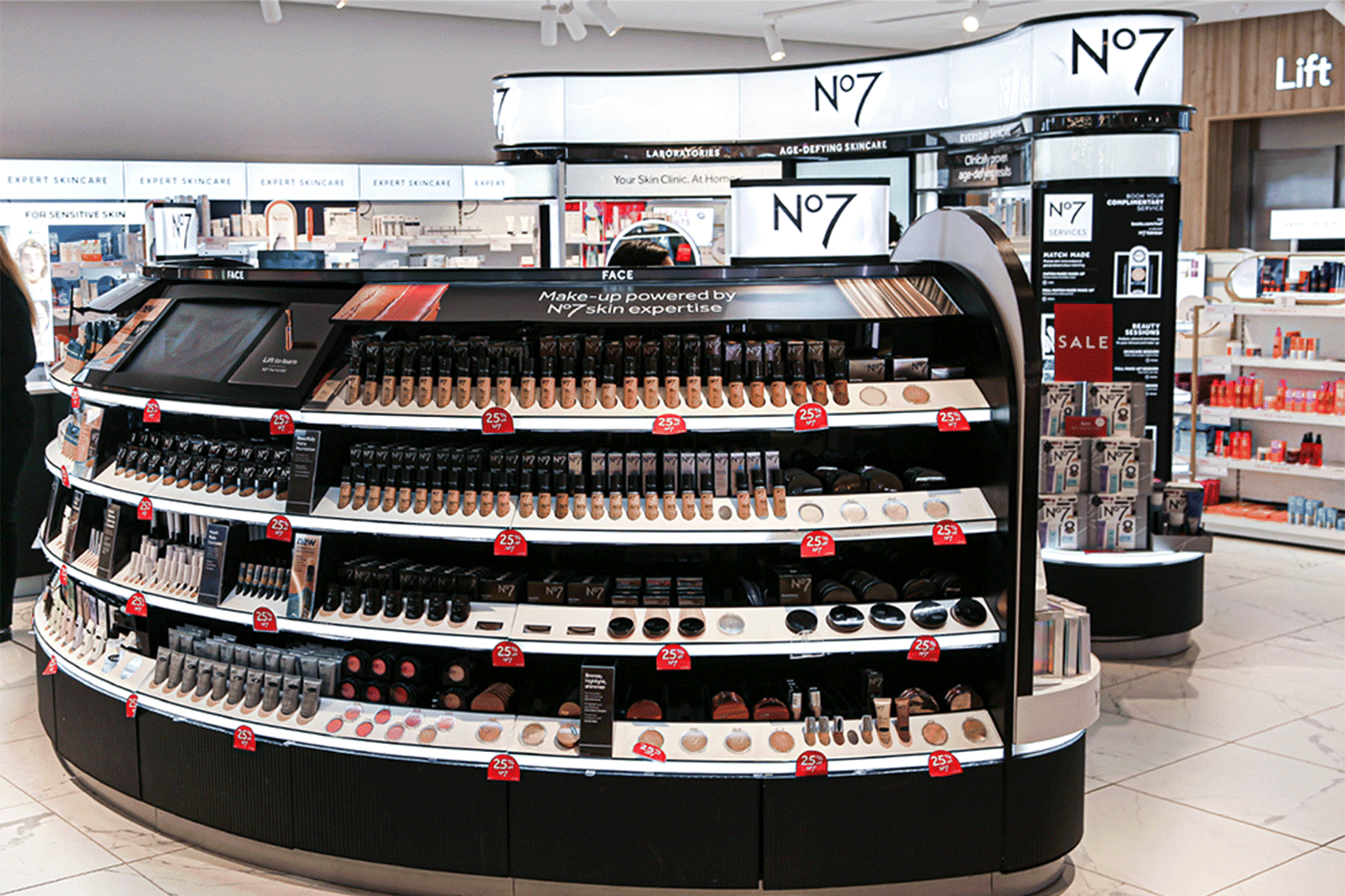
Iconic beauty complemented by design
Art Deco classic aesthetics and customer-centric thinking were behind our transformative reimagining of Boot’s No7 environment, with two central islands that intuitively ground customers and guide them through the range of products. ‘Touch and learn’ stations and adjustable light levels create an immersive and bespoke feel to the space, and fixtures were developed in partnership with Wilson Brown.
The success of honing No7’s essence in its new environment led to application across three markets in the US, Thailand, and the UK, for all of which Twelve developed comprehensive visual guidelines.
In a nutshell:


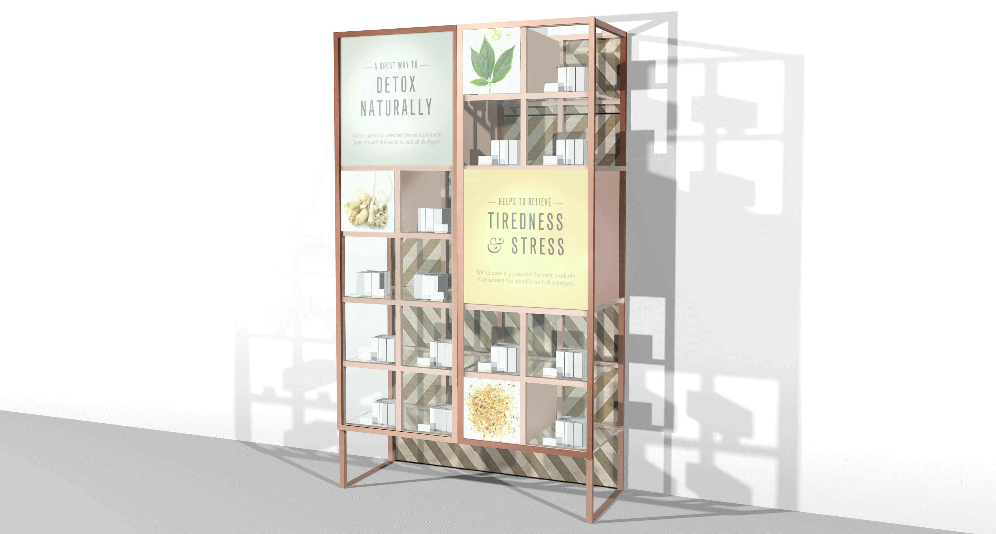
A healthy dose of design logic
Over nearly ten years of partnership with Lloyds Pharmacy and its European pharmacy network, we’ve been responsible for a host of strategic interventions that position the business at the forefront of health and beauty. Most recently, we’ve assisted them in securing pilot trials for their skincare and vitamin ranges that resulted in a 30% performance increase.
How can environment design make such waves for a brand like Lloyds? We stay true to the essence of the business and deliver cutting-edge adaptations to their in-store offering, whether that’s visually compelling merchandising techniques or the consistent messaging that inspires its customers towards more healthy living.
In a nutshell:


Design as the lynchpin between polarised services
The marriage between an inspirational, discoverable beauty environment and a trustworthy, reassuring pharmaceutical voice was central to the essence of Priceline’s store evolution, intended to fit store formats both with and without a pharmacy. We built a novel strategy, the ‘Health Guru’, acting as the anchor between the two distinct missions: health and beauty.
Our design approach was carried through the filter of the ‘sisters’, the target audience from beauty hunters to silver scripters for whom we developed a tone of voice, visual language, and zonal planning.
In a nutshell:


Holistic by design: wellbeing for all the senses
Our food store concept for Woolworths was thriving. To build on its success, we created a ‘destination health and wellness offer’ representative of the brand’s commitment and passion for healthy eating and living. This took shape as a unique yet integrated department dedicated to vitamins, supplements and healthcare products.
We opted for an immersive experience, crafting a space and atmosphere that spoke to the senses with interactive screens, sound showers, seasonal spaces, and, at its core, a living tree symbolising vitality, wellbeing, and nature.
In a nutshell:


Explore more sectors

Find us on social


London
The Old School House
41 Woodbridge Street
London, EC1R 0ND
+44 (0)20 7251 7878
Sydney
372 Elizabeth Street
Surry Hills
NSW 2010, Australia